- Home
- Brand guidelines
- Accessibility
- Flourishes and User Interface (UI) elements
Flourishes
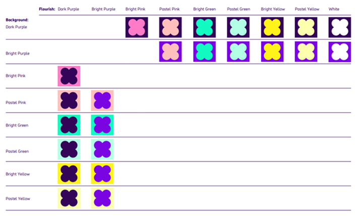
When using Flourishes on coloured backgrounds, some colour combinations work better than others.
All the most successful colour combinations are shown below.
Avoid using colour combinations that are not included below as there might not be enough contrast.
Flourish combinations that are allowed
If the background is Dark Purple, we can use:

- Bright Purple flourish
- Bright Pink flourish
- Pastel Pink flourish
- Bright Green flourish
- Pastel Green flourish
- Bright Yellow flourish
- Pastel Yellow flourish
- White flourish
If the background is Bright Purple, we can use:

- Dark Purple flourish
- Bright Pink flourish
- Pastel Pink flourish
- Bright Green flourish
- Pastel Green flourish
- Bright Yellow flourish
- Pastel Yellow flourish
- White flourish
If the background is Bright Pink, we can use:

- Dark Purple flourish
- Bright Purple flourish
- Pastel Pink flourish
- Bright Green flourish
- Pastel Green flourish
- Bright Yellow flourish
- Pastel Yellow flourish
- White flourish
If the background is Pastel Pink, we can use:

- Dark Purple flourish
- Bright Purple flourish
- Bright Pink flourish
If the background is Bright Green, we can use:

- Dark Purple flourish
- Bright Purple flourish
- Bright Pink flourish
- Bright Yellow flourish
- White flourish
If the background is Pastel Green, we can use:

- Dark Purple flourish
- Bright Purple flourish
- Bright Pink flourish
- Pastel Pink flourish
- Bright Green flourish
If the background is Bright Yellow, we can use:

- Dark Purple flourish
- Bright Purple flourish
- Bright Pink flourish
- Bright Green flourish
- White flourish
If the background is Pastel Yellow, we can use:

- Dark Purple flourish
- Bright Purple flourish
- Bright Pink flourish
- Bright Green flourish
If the background is White, we can use:

- Dark Purple flourish
- Bright Purple flourish
- Bright Pink flourish
- Bright Green flourish
- Bright Yellow flourish
Flourish combinations that are not allowed
Avoid using the following colour combinations as there might not be enough contrast.
If the background is Pastel Pink, we cannot use:

- Bright Green flourish
- Pastel Green flourish
- Bright Yellow flourish
- Pastel Yellow flourish
- White flourish
If the background is Bright Green, we cannot use:

- Pastel Pink flourish
- Pastel Yellow flourish
If the background is Pastel Green, we cannot use:

- Bright Yellow flourish
- Pastel Yellow flourish
- White flourish
If the background is Bright Yellow, we cannot use:

- Pastel Pink flourish
- Pastel Green flourish
- Pastel Yellow flourish
If the background is Pastel Yellow, we cannot use:

- Pastel Pink flourish
- Pastel Green flourish
- Bright Yellow flourish
- White flourish
UI elements
UI elements include:
- buttons
- menus
- form input boxes
- any other interactive elements that require the end user to interact with
The colour contrast requirement of 3:1 only applies to the UI element and the immediate background colour. The secondary background colour of the UI element can have a secondary background colour from the Flourish combinations.
*Borders cannot be used to allow non-compliant colour combinations*

Combinations
Dark Purple can be used with:
- Bright Pink
- Pastel Pink
- Bright Green
- Pastel Green
- Bright Yellow
- Pastel Yellow
- White
Bright purple can be used with:
- Pastel Pink
- Bright Green
- Pastel Green
- Bright Yellow
- Pastel Yellow
- White

