- Home
- Brand guidelines
- Accessibility
- Text and background colours
Text and background colours
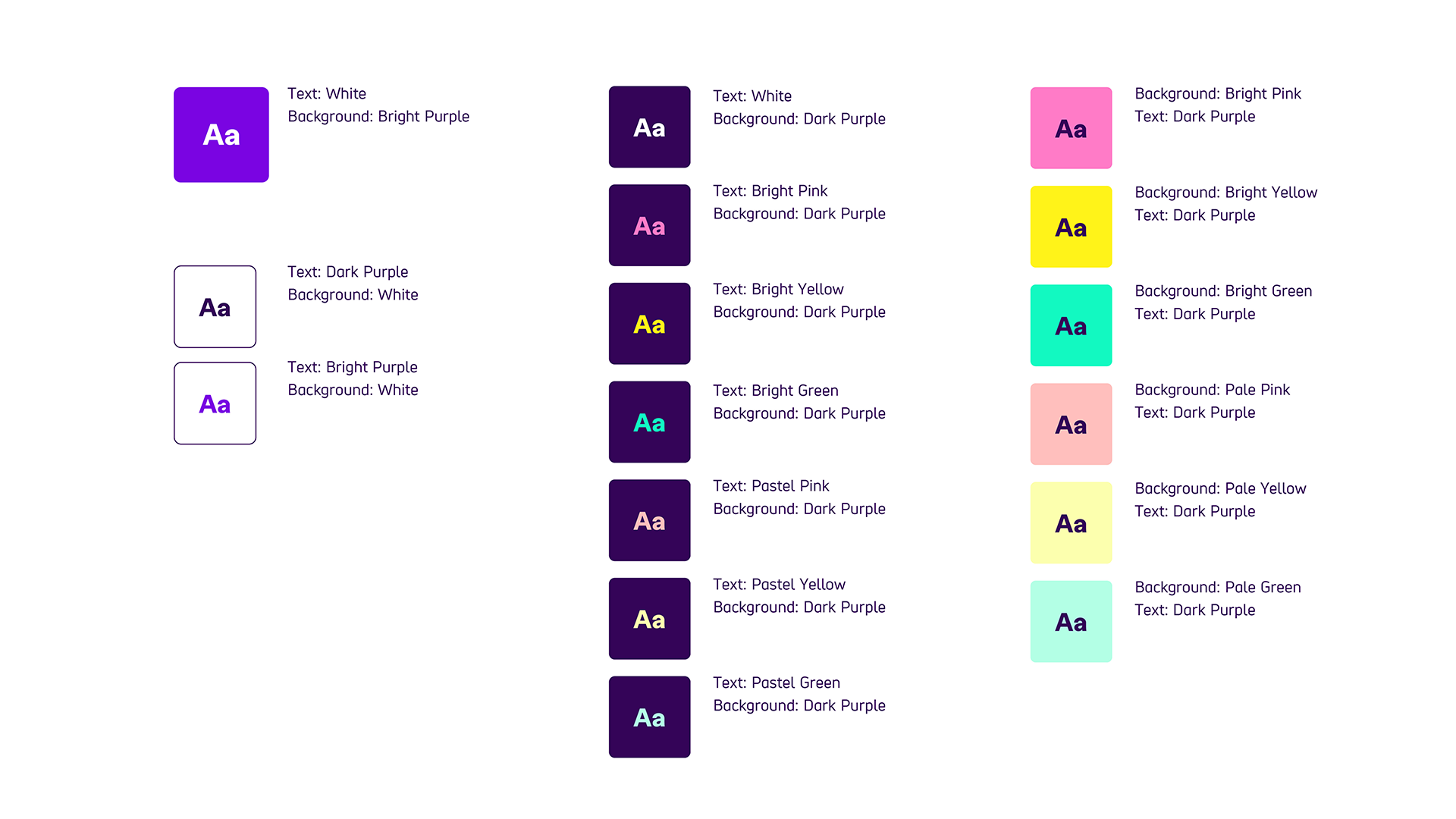
The most important thing we need to keep in mind when using the new brand colour combinations is contrast. The following colour combinations have been checked and have enough contrast. These are the only colour combinations you should use.
The chart below shows which text and background colours you can use together.

Please note, these are the ONLY text and background combinations that you should use.
They are all fully compliant with AAA accessibility rating. This is the highest level of colour contrast, with a minimum ratio of 7:1 between 2 colours.
The exception is Bright Pink, which only has a AA rating for text under 18pt. This is the medium level of colour contrast, with a minimum ratio of 4.5:1 between two colours. You can only use Bright Pink and Dark Purple for headings, text over 18pt, and other visual elements.
Colour combination chart details
-
Bright Purple background
- White text
-
White Background
- Dark Purple text
- Bright Purple text
-
Dark Purple background
- White text
- Bright Pink text
- Bright Yellow text
- Bright Green text
- Pastel Pink text
- Pastel Yellow text
- Pastel Green text
-
Dark Purple text
- Bright Pink background
- Bright Yellow background
- Bright Green background
- Pastel Pink background
- Pastel Yellow background
- Pastel Green background

