- Home
- Brand guidelines
- Guidelines
- Brand assets
- Action Lozenge
The purpose of the Action Lozenge is to create:
- urgency
- momentum
- direction
- exclamation
- positive assertion
In its physical sense, it is an expansion of the circle, relating to expanding views on disability.
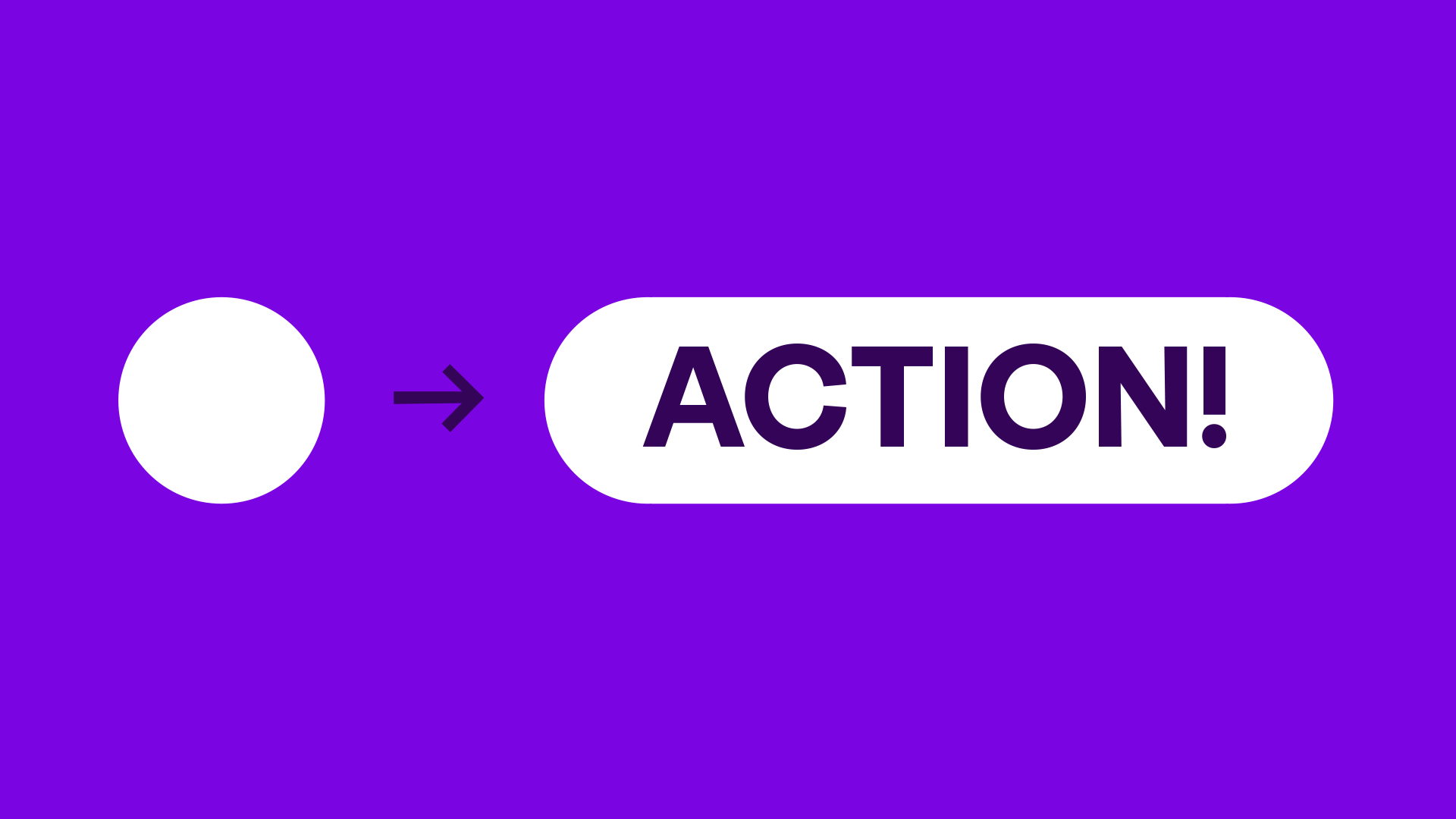
Examples of Action Lozenges in use
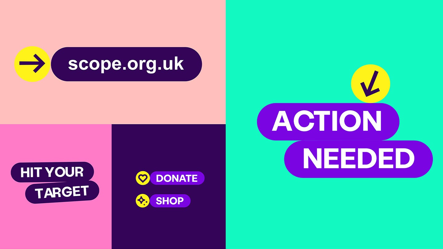
We can combine the Action Lozenge with our icons or use them on their own.

-
Image description
Examples showing Action Lozenges and icons:
- arrow icon pointing up at Action Lozenge saying 'action needed'
- heart and star icons next to 2 Action Lozenge buttons with 'donate' and 'shop'
- Action Lozenges with no icon saying 'hit your target'. Bottom lozenge is at an angle.
- arrow icon pointing down at Action Lozenge saying 'action needed'
- bullseye icon above Action Lozenge saying 'Bang on!'
- impact icon below Action Lozenge saying 'make impact'
- megaphone icon above Action Lozenge saying 'better lives'
Construction
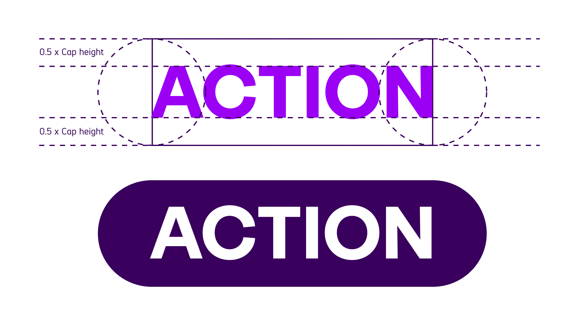
Use the steps below to keep the lozenge treatment consistent across our brand.
- Type your word or message. This can be upper or sentence case.
- Measure the cap height by drawing a frame around the word or message.
- Double the height of the frame, distributing space equally above and below the message. This gives you the correct vertical padding between the message and lozenge outline.
- Add circles to either end of the frame, making sure they align centrally with the edge of the message.
- Combine the shapes to create the lozenge.
The lozenge should primarily appear in Bright or Dark Purple with white text. They may also appear in white with Dark Purple text, when used on a Bright or Dark Purple background.
Variations
The Action Lozenge can be used in a number of ways to create dynamic headlines and calls to action.
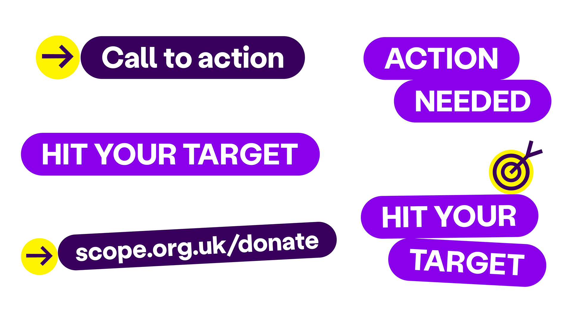
- Action Lozenges can be used around individual words or messages (with a maximum of 3 words).
- Messages can be split across a maximum of 2 lozenges.
- When 2 lozenges are used, they should stack directly on top of one another. Tabbing should be used to create a more energised feel (while always retaining readability).
- Lozenges can be tilted within a range of -3° to 3° to create a 'sticker' effect. In this instance, lozenges can overlap with each other and other brand elements. But they must always be readable and accessible.
- Lozenges can be locked up with icons. Make sure they are the same size as the lozenge.
What not to do
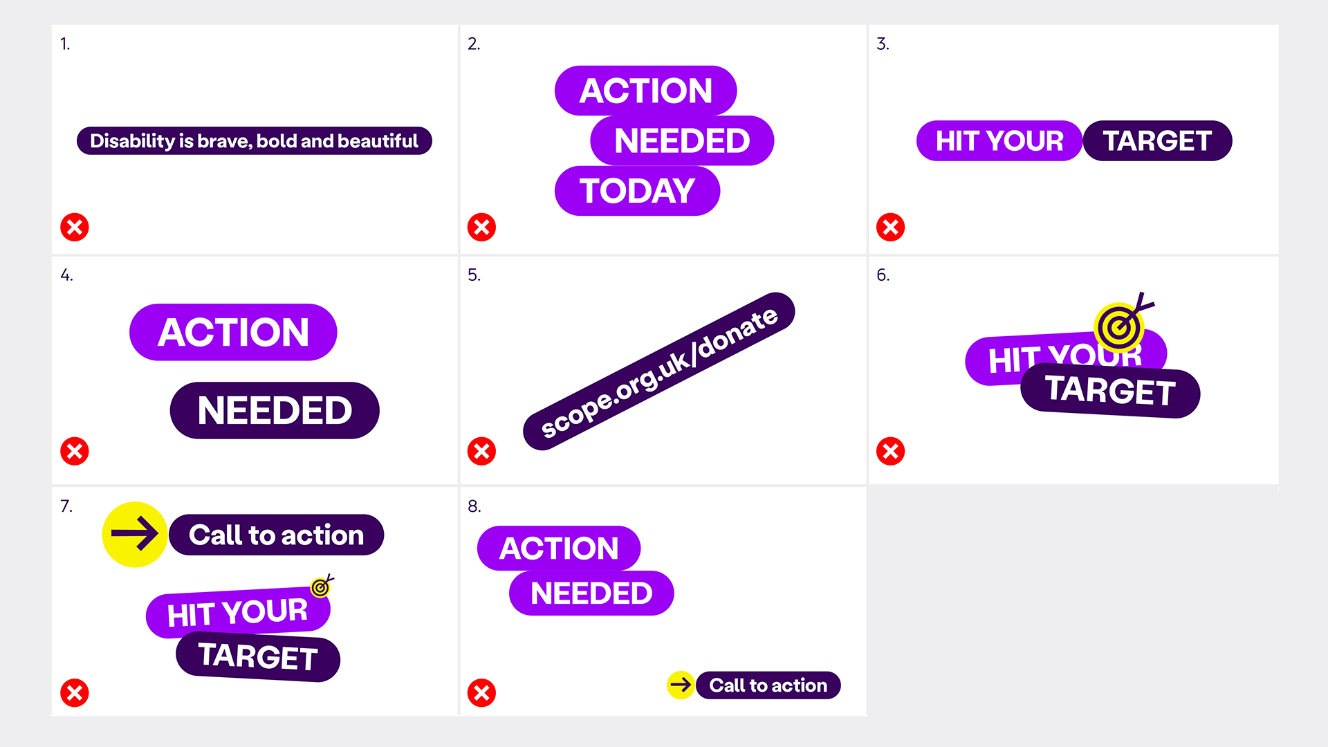
To keep the Action Lozenge consistent, accessible and impactful, avoid the following:
- Do not use the lozenge with messages longer than 3 words.
- Do not use more than 2 lozenges together.
- Do not stack lozenges horizontally.
- Do not leave gaps between lozenges. They should sit directly on top of one another.
- Do not tilt lozenges beyond the -3° to 3° range.
- Do not overlap the lozenges in a way that obscures messaging or key content.
- Do not apply the icons at a different scale to lozenge/s when locked up together.
- Do not use multiple lozenges or lock ups in the same application or eyeline.

