- Home
- Brand guidelines
- Guidelines
- Brand assets
- Amplification Circle
The Amplification Circle is always active and used to highlight a key message, cause or need. This can be done in multiple ways using different content.

The examples above show how we can use the Amplification Circle to include our:
- messaging
- photography
- expressive illustrations
- iconography
Messaging: sizing and placement
Amplification Circles always appear in Bright Purple and vary in size depending on the length of the title and the format.
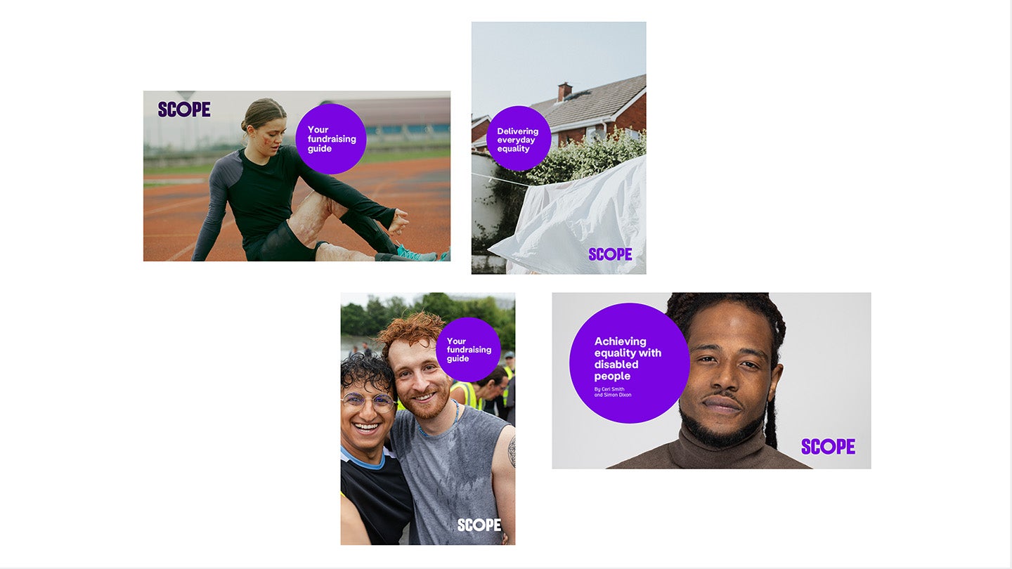
-
Image description
Example 1 is a widescreen photo of an athlete on a track stretching, using our reportage photography style. The circle off to the right of their body, slightly overlapping their arm. The text says 'your fundraising guide' over 3 lines. Dark Purple Scope logo is in the top left.
Example 2 is a portrait photo of a white sheet on a washing line, using our details photography. The circle on the left of the photo with the text 'delivering everyday equality'. Bright Purple Scope logo is in the bottom right over the sheet.
Example 3 is a portrait photo of 2 people after a race, they're hugging.The circle sits in the top right, slightly overlapping the face of one of the people. Text says 'Your fundraising guide'. White Scope logo is in the bottom right.
Example 4 has a widescreen photo of a person close up, using our Hero photography. The circle sits on the left and overlaps the face sitting close to the eye. Text says 'achieving equality with disabled people' and the authors below in smaller text. Bright Purple Scope logo is in the bottom right."
A selection of Amplification Circles are shown above. These show where the circle can be placed over our reportage and details photography. It also shows the different ways we can include our messaging.
This page explains in more detail how to use the Amplification Circle.
Long titles in A4 format
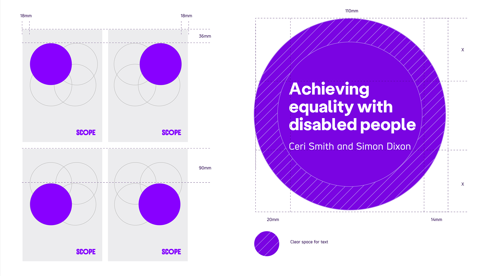
The following guidance is for Amplification Circles in A4 formats with a long message (more than 3 words) and a subtitle. They:
- should be 110mm diameter
- should have 20mm between the edge and first letter
- should include 14mm of clear space around
- can have 4 different positions
Position of top 2 circles sit 36mm from the top of the page. The position of the bottom 2 circles sit 90mm from the top of the page. All circles are placed 18mm from the left or right side of the page.
The placement of the window depends on the composition of the image in the background.
Note: Please use these as a visual guide for using the Amplification Circle in other formats. For example, A5, A3, A2.
Examples
Some examples of good compositions are shown below.
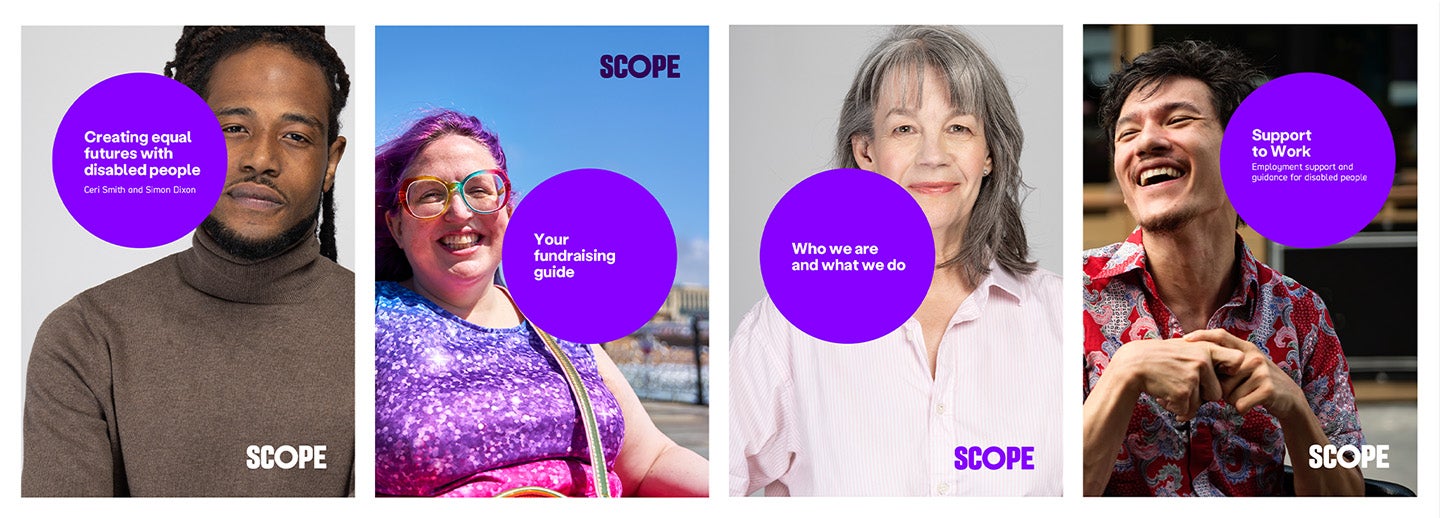
-
Image description
Examples 1 and 3 use our hero photography with the circle overlapping the left of each person's face. Circle 1 says 'creating equal futures with disabled people' with authors of the report as the subtitle. Circle 3 has 'who we are and what we do'.
Example 2 has a full body shot using our reportage photography of someone smiling with the costline behind them. The circle sits to the right just above their torso. Circle says 'your fundraising guide'.
Example 4 uses our reportage photography of a man in front of a building, possibly a wheelchair user. The circle partially overlaps their face. Circle says 'support to work' with subtitle 'Employment support and guidance for disabled people'.
Short titles in A4 format
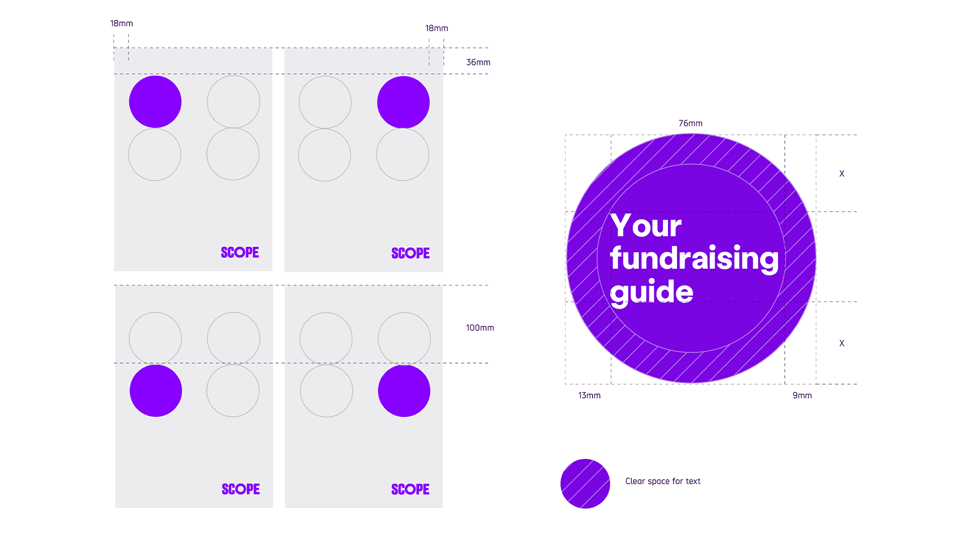
The following guidance is for Amplification Circles used in A4 formats with a short message (3 words or less) and do not have a subtitle. They:
- should be 76mm diameter
- should have 13mm between the edge and first letter
- should include 9mm of clear space around
- can have 4 different positions
Position of 2 circles sit 36mm from the top of the page. The position of the other 2 circles sit 100mm from the top of the page. All circles are placed 18mm from the side of the page.
The placement of the window depends on the composition of the image in the background.
Note: Please use these as a visual guide for using the Amplification Circle in other formats. For example, A5, A3, A2.
Examples
Some examples of good compositions are shown below.
-
Image description
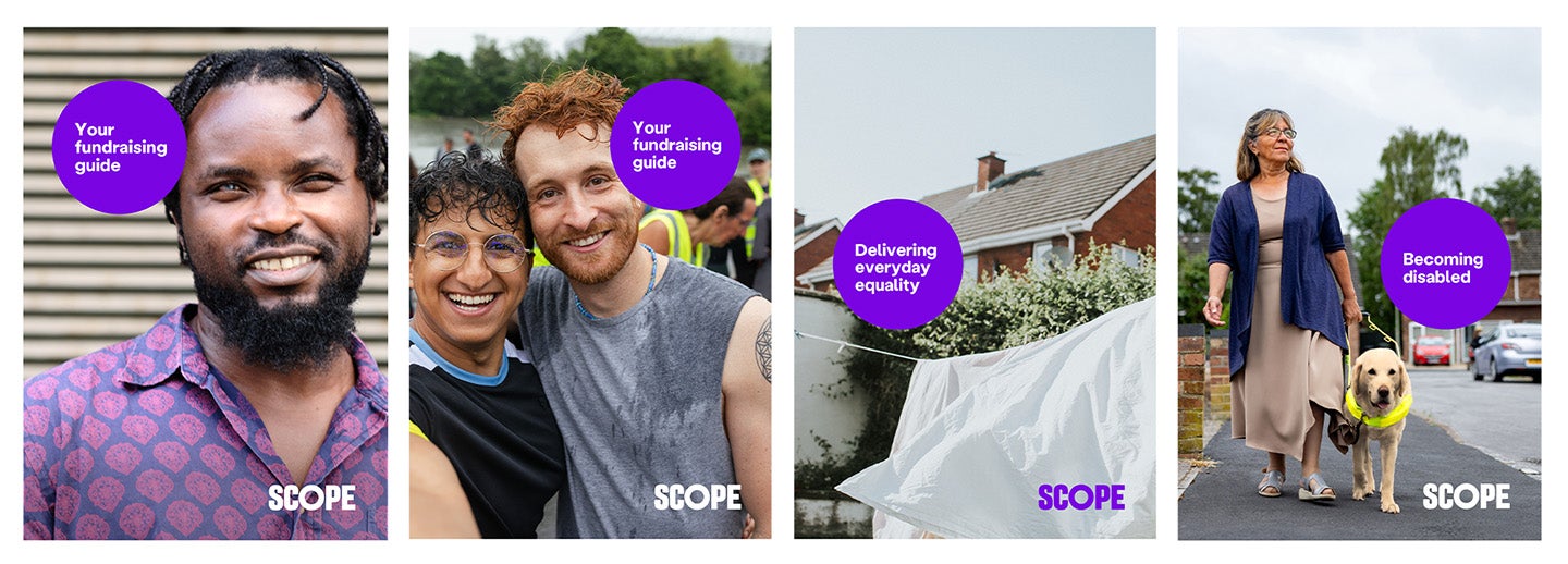
Examples 1 and 2 have reportage photography, one with a single man in front of a building, the other 2 people who have just finished a race. The circle sits on the top left, overlapping some of the person's hair in example 1. In example 2 it sits to the top right overlapping his face. Both circles say 'your fundraising guide'.
Example 3 is a white sheet on a washing line, using our details photography. The circle on the left of the photo with the text 'delivering everyday equality'.
Example 4 has reportage photography of a a woman with her guide dog walking down the street. The circle is placed in the middle and to the right. Circle says 'Becoming disabled'.
Long titles in widescreen format
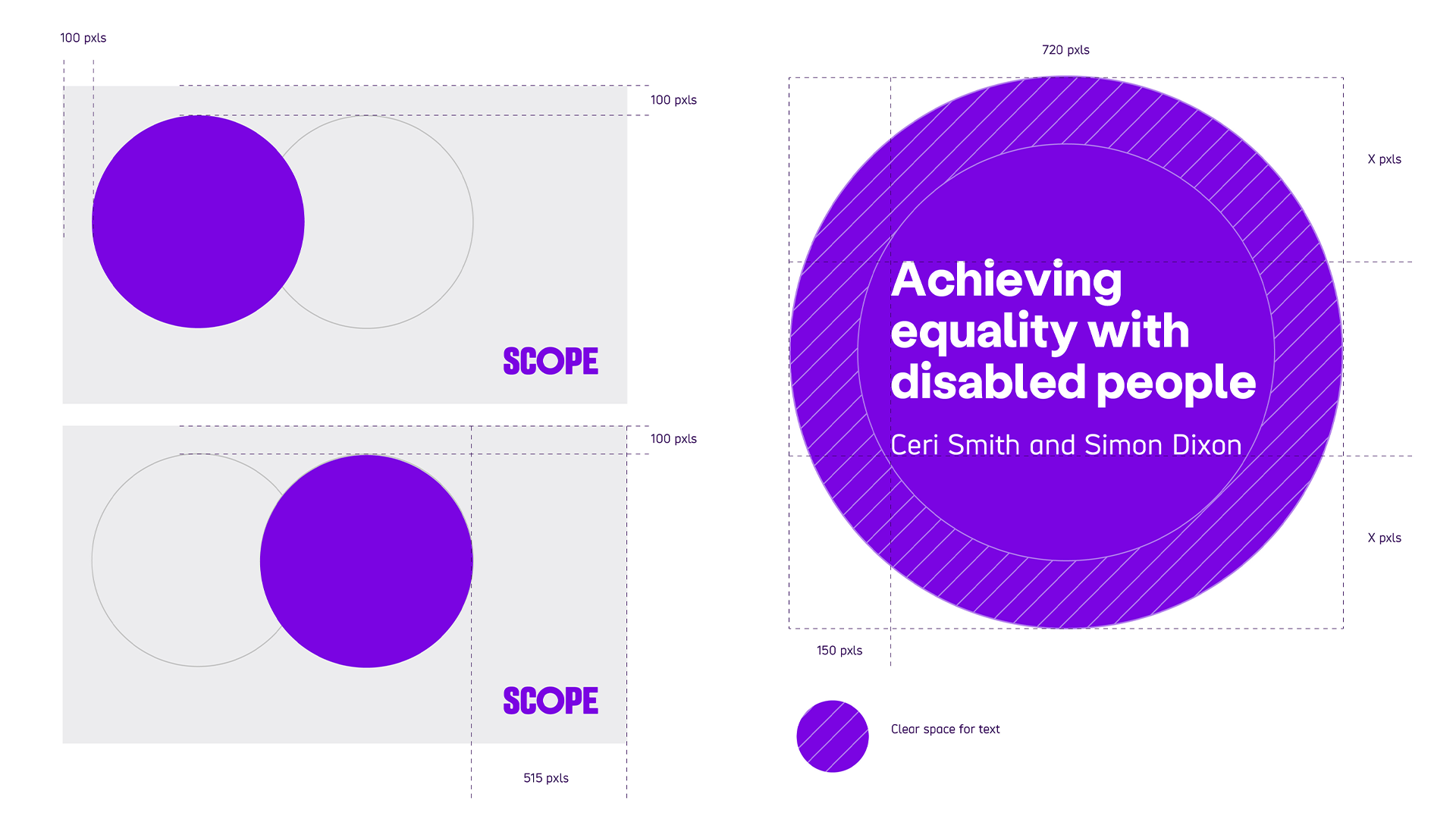
The following guidance is for Amplification Circles used in widescreen formats with a long message (more than 3 words) and a subtitle. They:
- should be 720 pixels diameter
- should have 150 pixels between the edge and first letter
- have 2 different positions. Both positions sit 100 pixels from the top of the page. Left position sits 100 pixels from the left side of the page. Right position sits 515 pixels from the right side.
The placement of the window depends on the composition of the image in the background.
Examples
Some examples of good compositions are shown below.

-
Image description
Example 1 uses our hero photography. It has a face of a man with the circle overlapping on the left. Text says 'Achieving equality with disabled people' and has authors as subtitle.
Example 2 uses our reportage photography of a woman in a wheelchair outside with the background blurred. She's smiling. The circle overlaps her shoulder on the right side. The circle has the same text.
Short titles in widescreen format
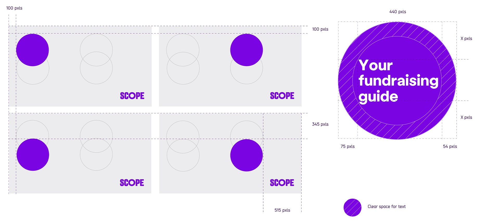
The following guidance is for Amplification Circles used in Widescreen formats with a short message (3 words or less) and no subtitle. They:
- should be 440pixels diameter
- should have 75pixels between the edge and first letter
- should include 54mm of clear space around
- have 4 different positions
Top 2 positions sit 100 pixels from the top of the page. Bottom positions sit 345 pixels from the top of the page. Left positions sit 100 pixels from the left side of the page. Right positions sit 515 pixels from the right side.
The placement of the window depends on the composition of the image in the background.
Examples
Some examples of good compositions are shown below.
-
Image description
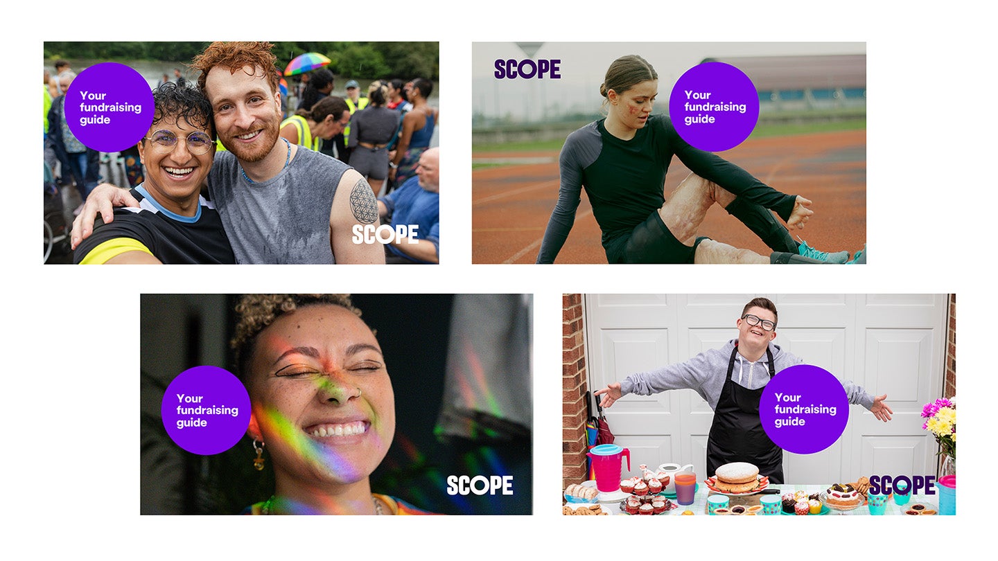
Example 1 is a widescreen photo of an athlete on a track stretching, using our reportage photography style. The circle off to the right of their body, slightly overlapping their arm. The text says 'your fundraising guide' over 3 lines.
Example 2 is a widescreen photo of 2 people after a race, they're hugging and looking at the camera.The circle sits in the top left, slightly overlapping the face of one of the people. Text says 'Your fundraising guide'.
Example 3 is hero photography of a person, they have rainbow light across their face and they're smiling with their eyes closed. Circle is placed slightly overlapping their head in a middle left position. Title says 'your fundraising guide'.
Example 4 is reportage photography of a young person behind a cake sale table with their arms out to show the table. Circle is placed slightly overlapping their torso and arm in the middle right position. Title says 'your fundraising guide'."
Tips and do not's
Tips
Circle composition:
- the circle can overlap with a subject in the image
- the logo should always sit on a 'clean' part of the image to make sure it's readable
- a subtle gradient can be added to the image to help with the legibility of the logo
Do not's
Here are some things to watch out for:
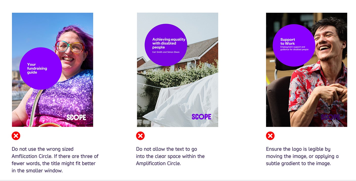
- Do not use the wrong sized Amplification Circle. If there are 3 or fewer words, the title might fit better in the smaller circle.
- Do not allow the text to go into the clear space within the Amplification Circle.
- Make sure the logo is legible by moving the image, or applying a subtle gradient to the image.
Below are examples of the 3 things to avoid:
Imagery
Sometimes images speak louder than words. The Amplification Circle can hold images as well as typographic messaging.
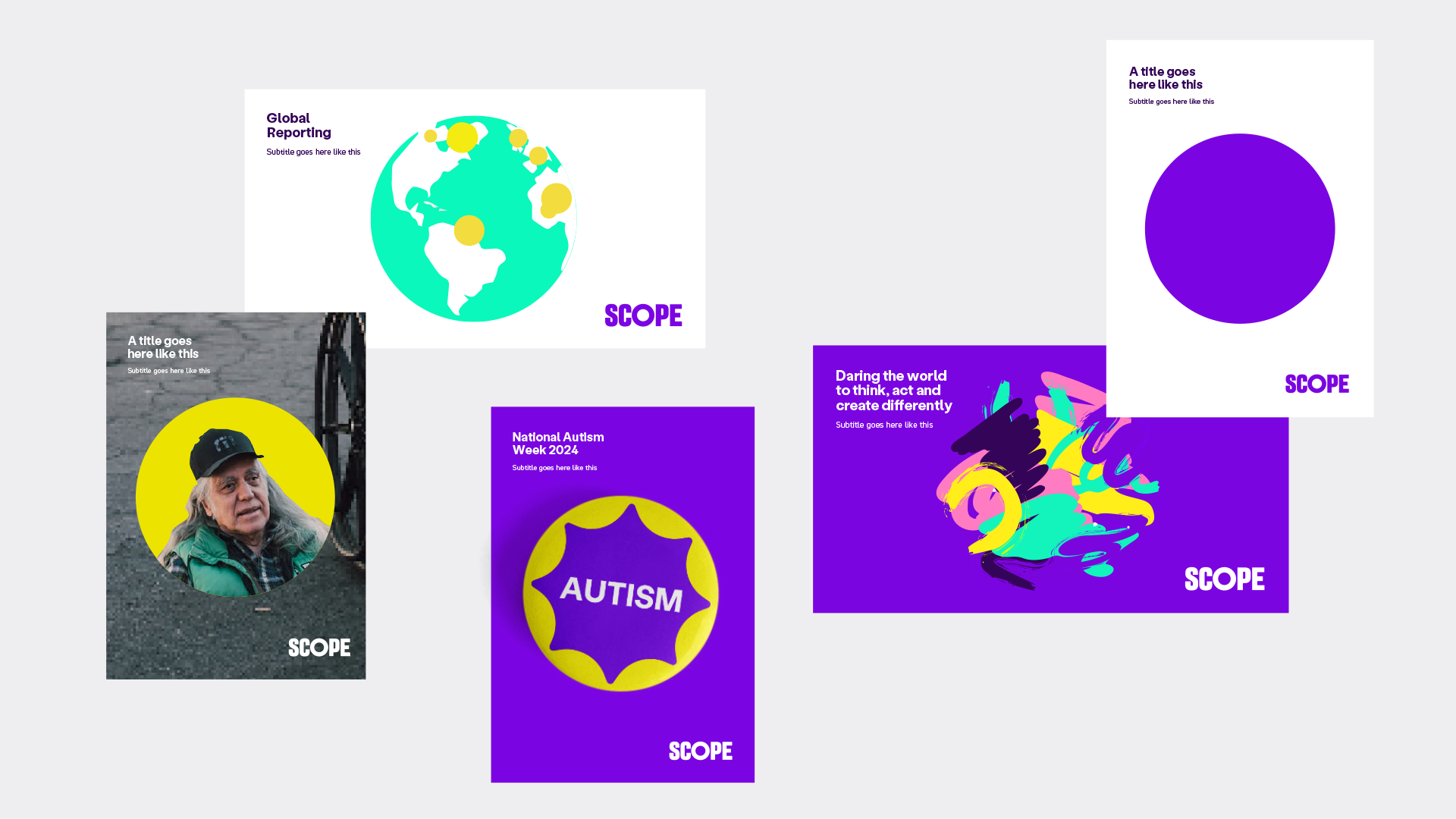
Keep it simple, relevant and bold in composition.
-
Image description
5 examples. 3 show a poster style with the circle at the centre. One has hero photography and a Bright Yellow background, one has Bright Yellow circle with a Bright Purple star flourish and Autism written in the centre, and one is the plain Bright Purple circle.
2 examples show a landscape page. One has a white background and the text 'global reporting' and the circle shows a Bright Green globe with Yellow circle markers. The other has a Bright Purple background with a paint strokes circle and text saying 'daring the world to think, act and create differently'.
Placement and sizing
A4 formats:
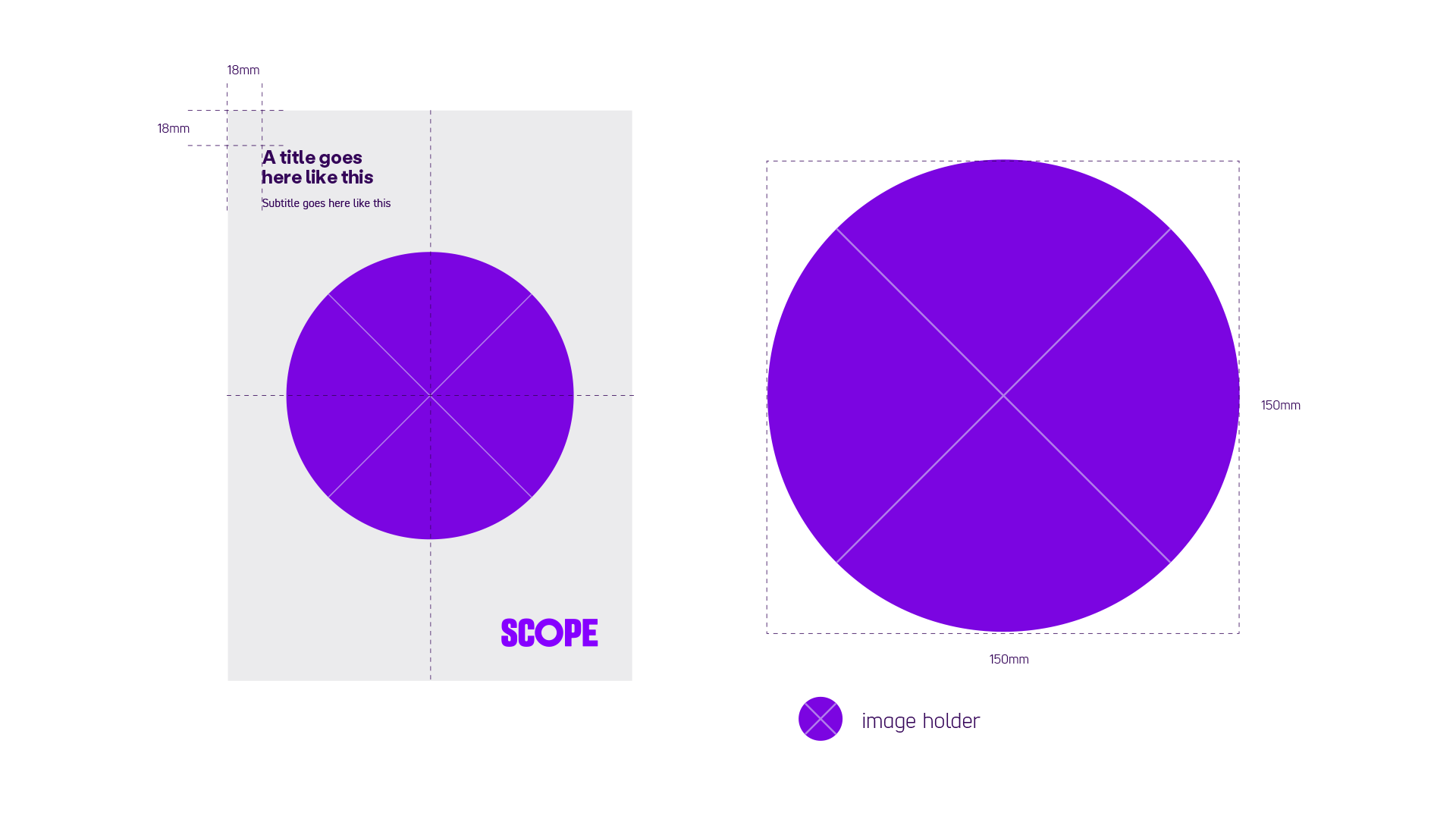
The image holder is centre aligned vertically and horizontally and measures 150mm in diameter. The title sits 18 by 18mm from the top left corner.
Widescreen formats:
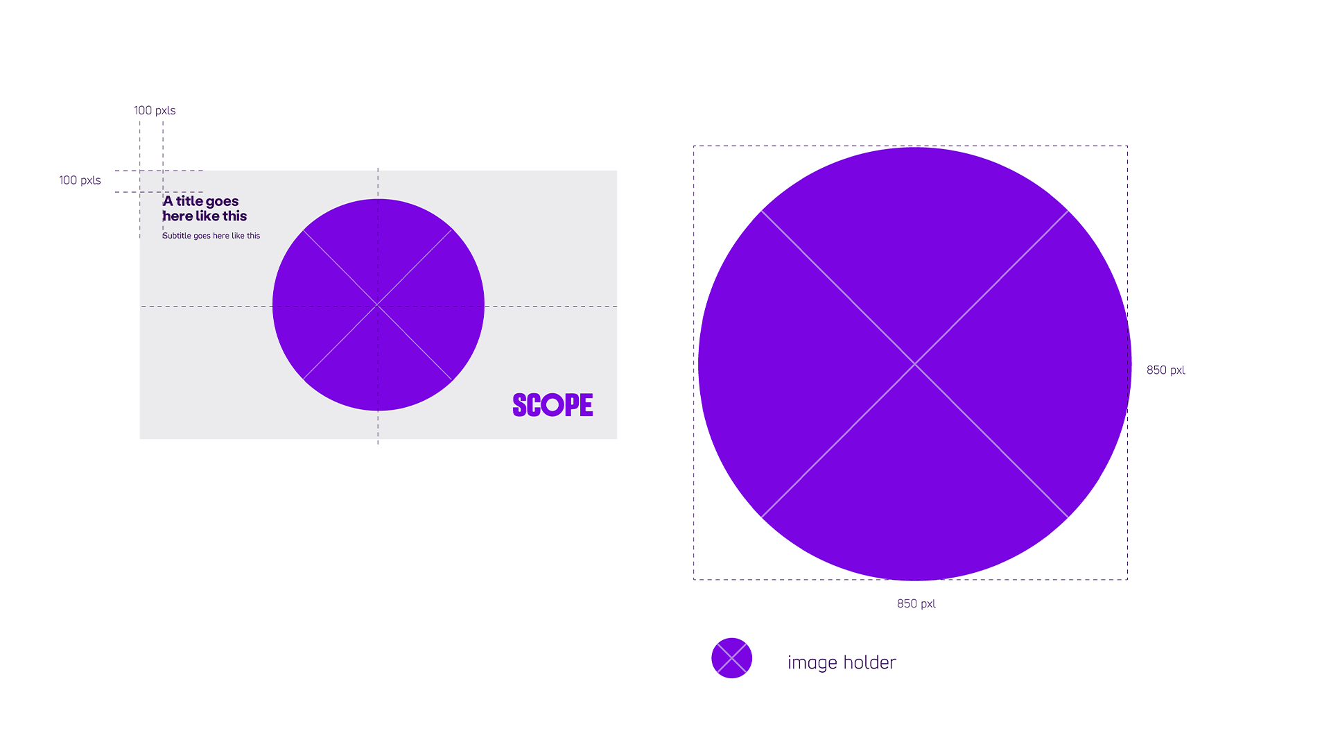
The image holder is centre aligned vertically and horizontally and measures 850 pixels in diameter. The title sits 100 by 100 pixels from the top left corner.
Expressive illustration

The Amplification Circle can act as a blank canvas for expressive illustration.
Some key rules that must be followed for creating bespoke illustrations are below:
- Always in brand colours
- The illustration must relate to the message
- The illustration must be circular, although it can break out of the circle
Some examples of bespoke illustrations along with corresponding headlines are shown above.
Note: only experienced designers should attempt expressive illustration.
-
Image description
3 expressive illustration amplification circle examples.
Circle 1 has paint strokes in brand colours with text below saying ‘daring the world to think, act and create differently’.
Circle 2 has cascading circles in brand colours. Text below says ‘creating positive impact for lives with disability’.
Circle 3 has a globe using Scope Bright Green with Bright Yellow circles over different locations. Text below says ‘global reporting’.

