Colour palette
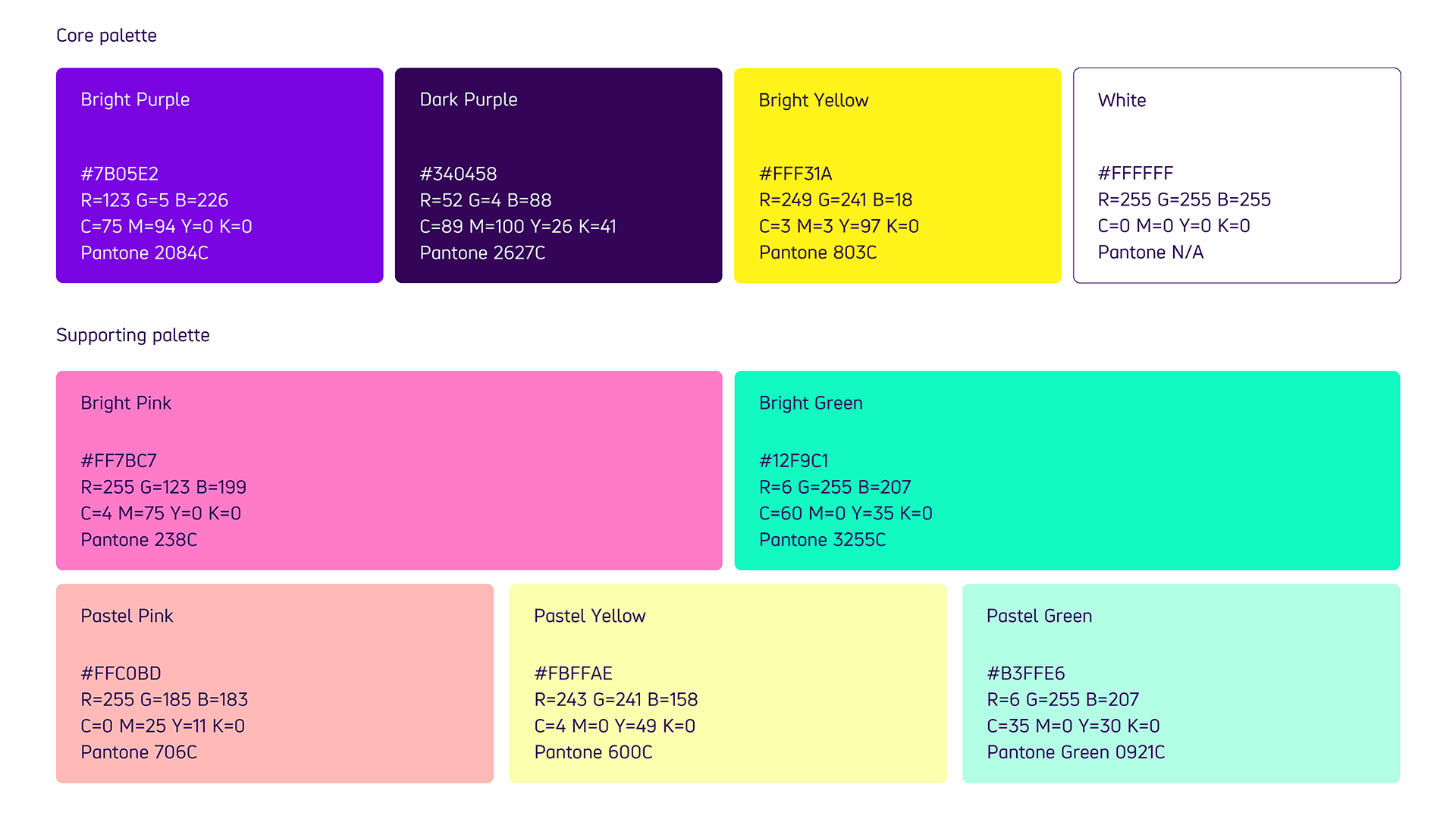
We are a purple brand, punctuated with Bright Yellow and white.
We have breadth which is provided by our supporting highlight colours. They come in bright and pastel tones, so the volume can be turned up or toned down depending on the type of content being created.
To learn more how to use our brand colours together, visit our brand accessibility section.

Colour codes
-
Core palette
Bright Purple:
- #7B05E2
- R=123 G=5 B=226
- C=75 M=94 Y=0 K=0
- Pantone 2084C
Dark Purple
- #340458
- R=52 G=4 B=88
- C=89 M=100 Y=26 K=41
- Pantone 2627C
Bright Yellow
- #FFF31A
- R=249 G=241 B=18
- C=3 M=3 Y=97 K=0
- Pantone 803C
White
- #FFFFFF
- R=255 G=255 B=255
- C=0 M=0 Y=0 K=0
- Pantone N/A
-
Supporting palette
Bright Pink
- #FF7BC7
- R=255 G=123 B=199
- C=4 M=75 Y=0 K=0
- Pantone 238C
Bright Green
- #12F9C1
- R=6 G=255 B=207
- C=60 M=0 Y=35 K=0
- Pantone 3255C
Pastel Pink
- #FFC0BD
- R=255 G=185 B=183
- C=0 M=25 Y=11 K=0
- Pantone 706C
Pastel Yellow
- #FBFFAE
- R=243 G=241 B=158
- C=4 M=0 Y=49 K=0
- Pantone 600
Pastel Green
- #B3FFE6
- R=6 G=255 B=207
- C=35 M=0 Y=30 K=0
- Pantone 0921C
Usage
Bright Purple is our most recognisable colour, which is used in high volumes.
It is supported by Dark Purple, which is used for all text and some backgrounds where differentiation is needed.
White should also be used for backgrounds, where 'breathing space' is needed.
Our Bright Yellow is used to signify call to actions and add vitality to all of our communications. It is also the background colour for our icons.
Our supporting colours should be used sparingly for moments of warmth and impact.
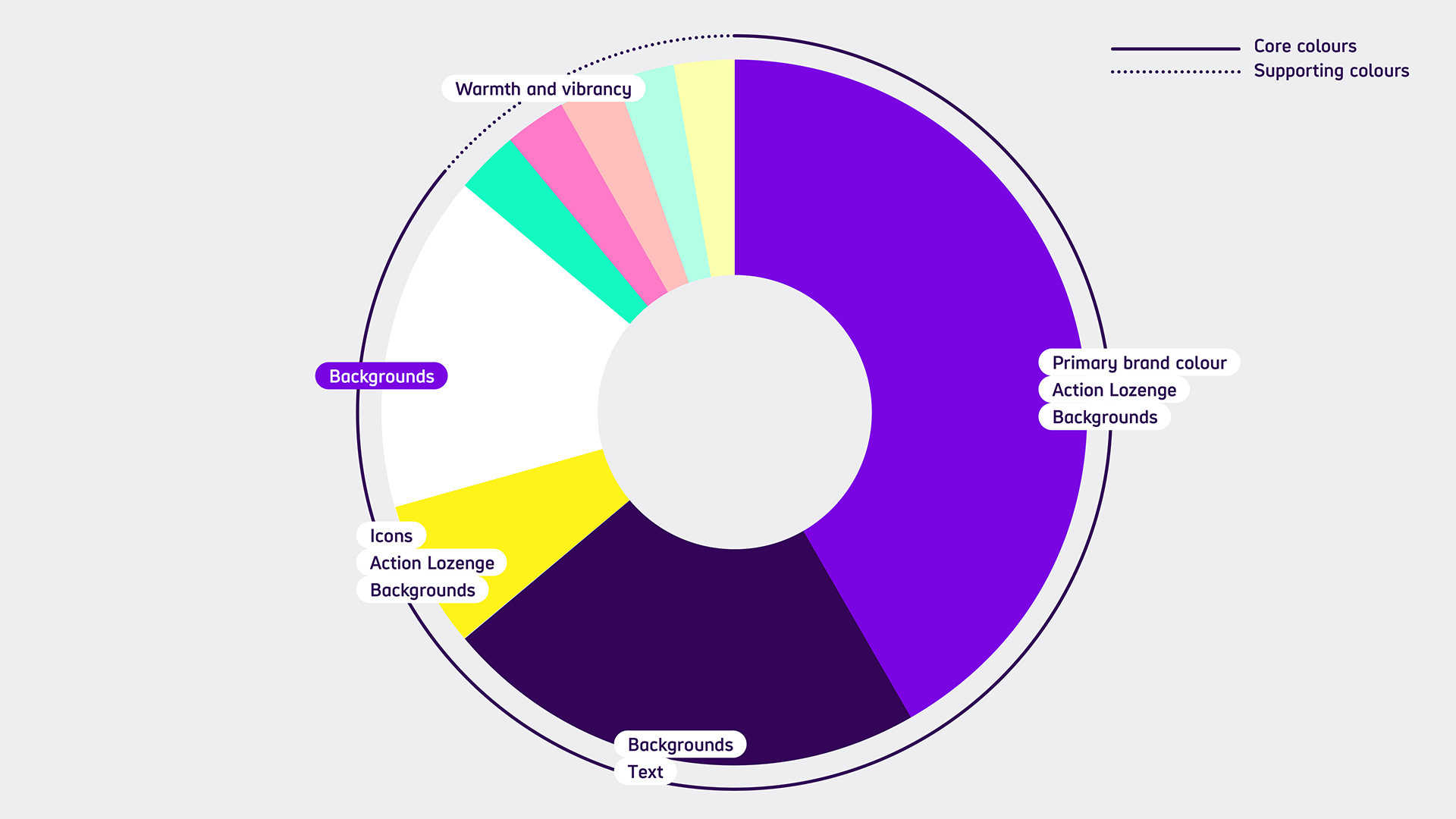
Colour usage ratios are shown in the diagram below.

-
Diagram description
Bright Purple has the biggest usage for:
- the primary brand colour
- backgrounds
- Action Lozenge
Dark Purple has second biggest use. It's used for text and backgrounds. White also has high use but is only used for backgrounds.
Bright Yellow has a smaller use than the purples and white but more than the other supporting colours. It's used for:
- Icons
- Action Lozenge
- Backgrounds
The remaining supporting colours have equal use. We use these for warmth and vibrancy.
Text and background colours
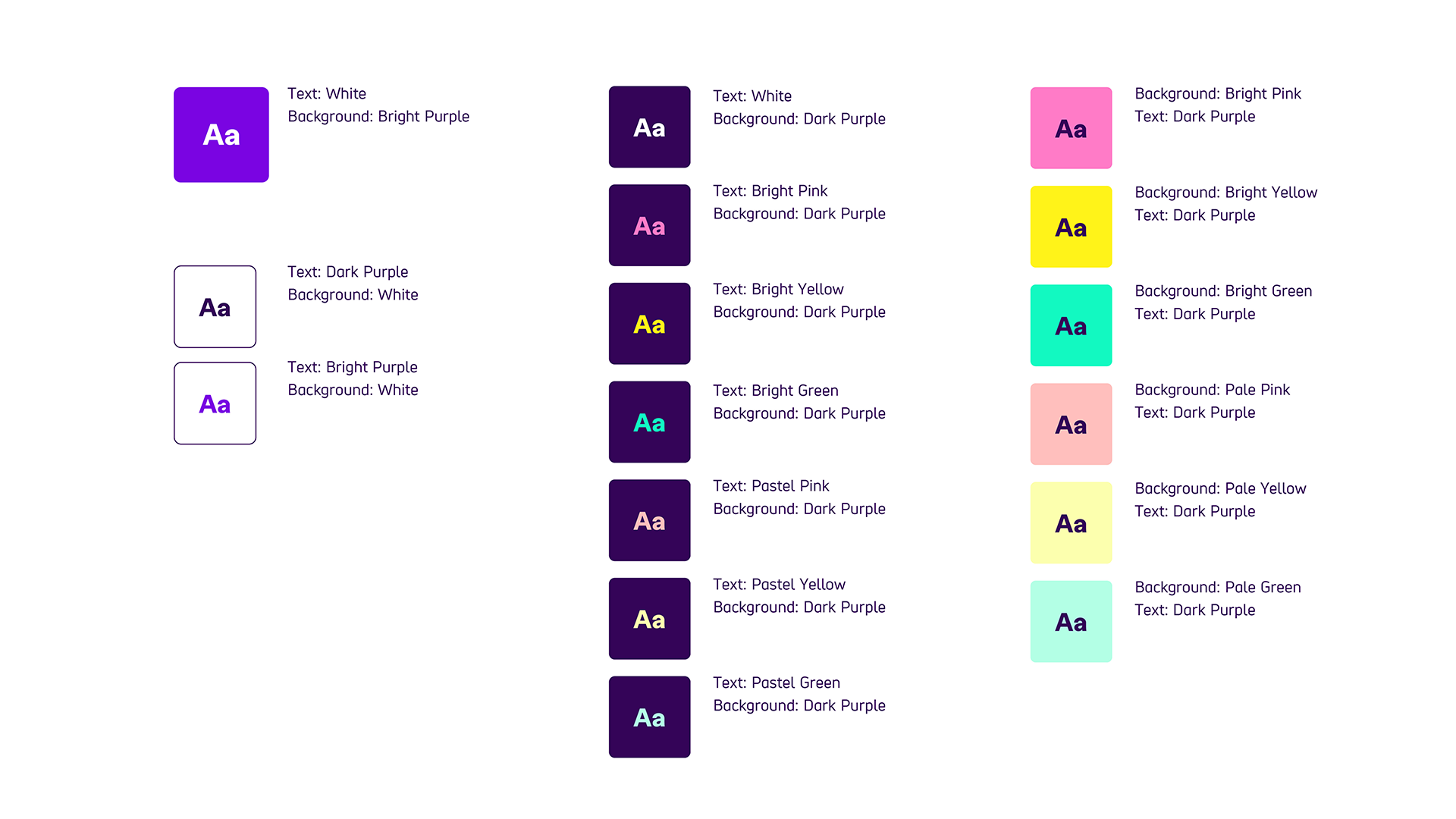
The most important thing we need to keep in mind when using the new brand colour combinations is contrast. The following colour combinations have been checked and have enough contrast.

Please note, these are the ONLY text and background combinations that you should use.
Colour combination chart details
-
Bright Purple background
- White text
-
White Background
- Dark Purple text
- Bright Purple text
-
Dark Purple text
- Bright Pink background
- Bright Yellow background
- Bright Green background
- Pastel Pink background
- Pastel Yellow background
- Pastel Green background
-
Dark Purple background
- White text
- Bright Pink text
- Bright Yellow text
- Bright Green text
- Pastel Pink text
- Pastel Yellow text
- Pastel Green text
Our logo and background colours
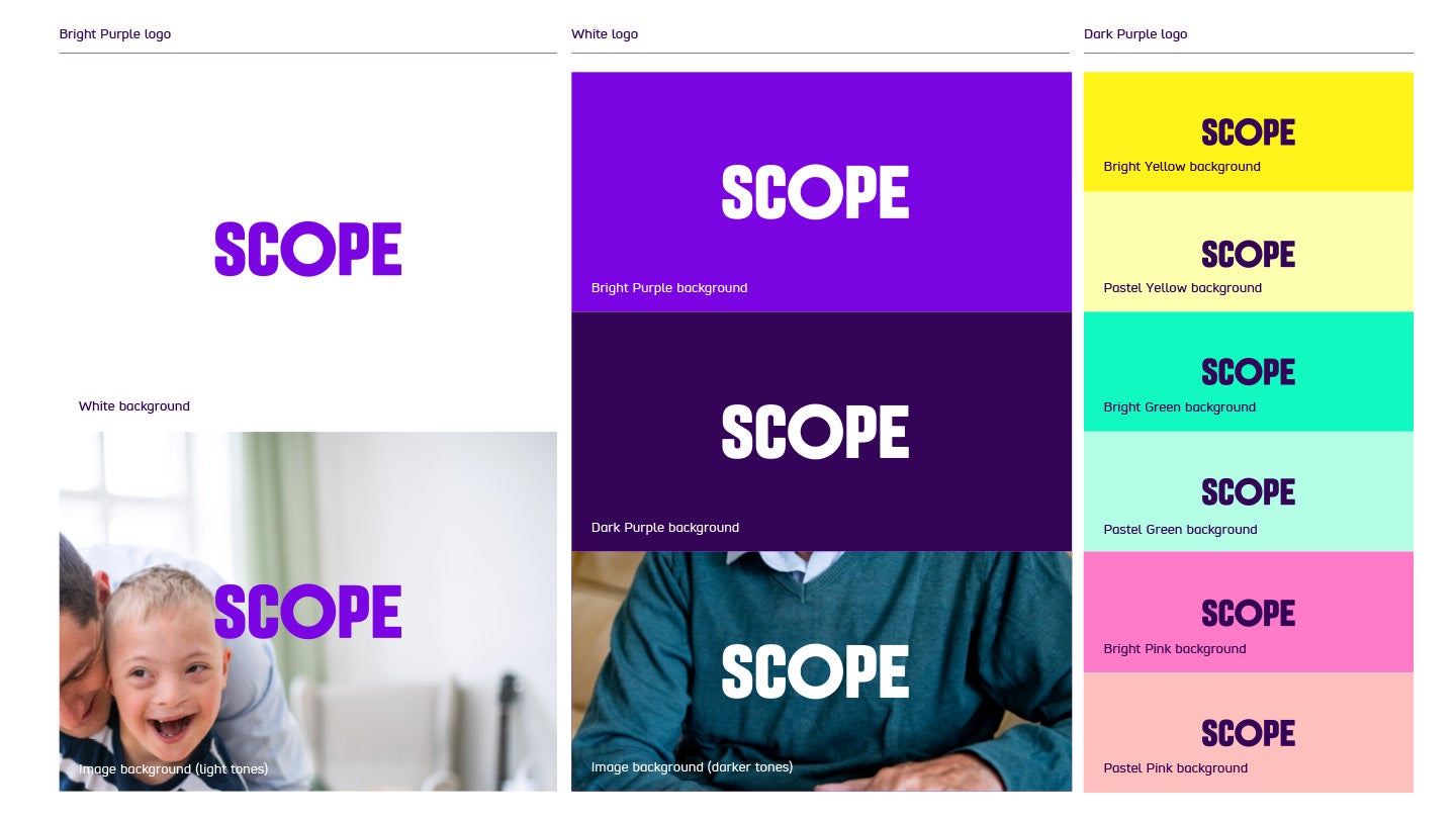
The logo can be used with all of our colours. Use:
- Bright Purple logo with a white background
- White logo with Bright Purple or Dark Purple background
- Dark Purple logo with any of the supporting colour palette
Permitted background colours

We can also place our logo over photography. Make sure the background photo is as clear and uncluttered as possible.
Use our:
- Bright Purple logo on light tone photography backgrounds
- White logo on darker tone photography backgrounds
Always make sure there is good contrast between the logo and the background. Use the WebAIM contrast checker.

