- Home
- Brand guidelines
- Guidelines
- Brand assets
- Flourish
The 'Flourish' is a supporting graphic device. The purpose of the Flourish is to house:
- personal details
- quotes
- storytelling details
This highlights the unique and wonderful differences people in the disabled community possess.
The following page explains the various functions of the Flourish and how to create them.
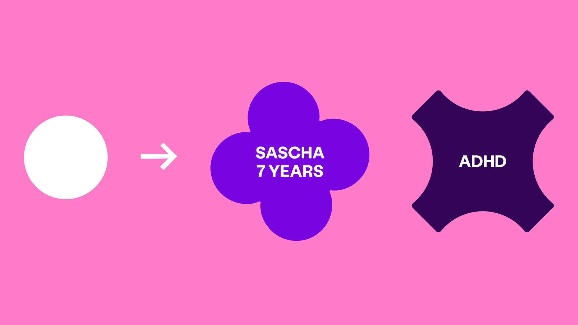
Variations
All 'flourishes' derive from the Scope circle, in that their width is always equal to their height.
Some shapes are celebratory, some shapes are purposely awkward, and some are more uniform than others.

This gives us a good range of shapes to use depending on the topic we are addressing.
Using the Flourish
The Flourish must only be used to denote a personal fact (like a name) or act as a background for a personal item. For example, a hobby or item that is sold in the Scope store.
Flourishes should never be used decoratively. The only exceptions are the super graphic (see below) and Scope merchandise.
Text should be centre aligned and in upper case. Try and keep the number of words to a minimum so that it fits comfortably within the Flourish. Cut out images can also be placed on top of any coloured flourish.
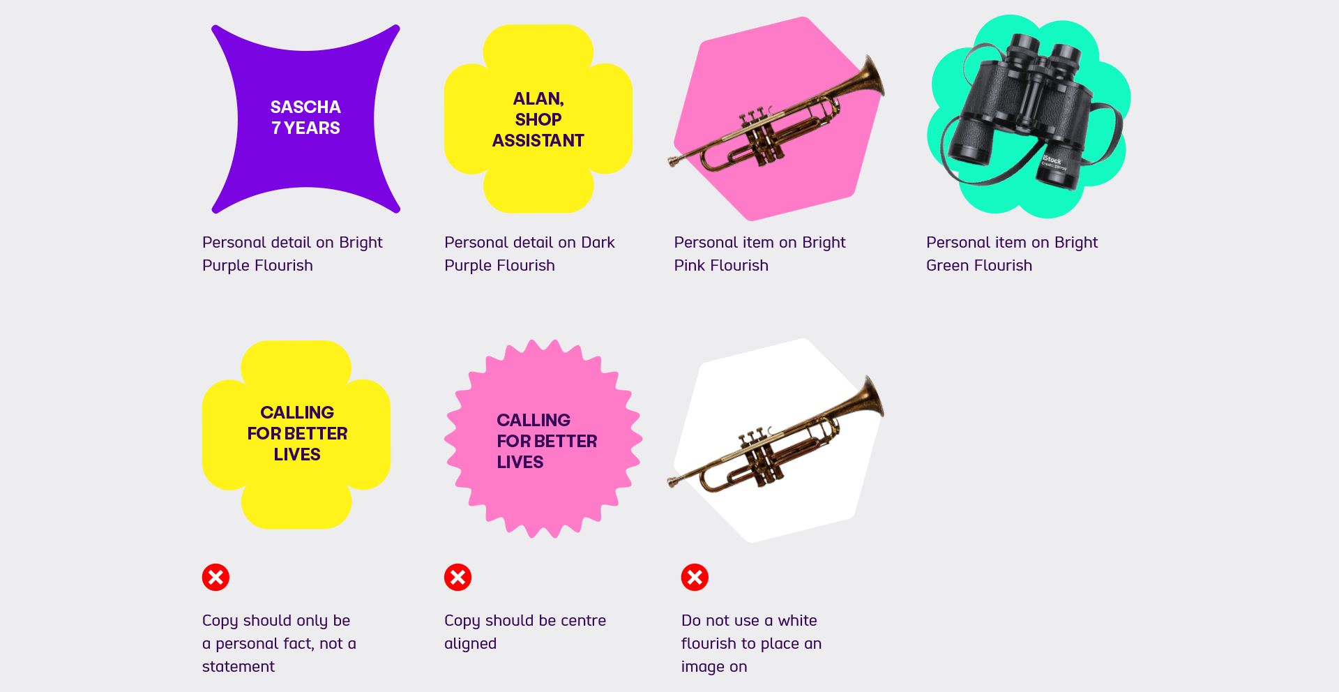
Do not's
When creating a Flourish, do not:
- write a statement, it should only be a personal fact
- use left aligned, text should be centre aligned
- use a white flourish to place an image on
Examples
The visuals below are examples of how we use the Flourish.

-
Image description
4 panels showing quotes from disabled people. Each uses hero photography in the Amplification Circle. There's different shaped Bright Purple flourishes overlaid in the bottom right corner of the circle. Each Flourish includes the speaker’s name.
The quote for 2 of the panels sit below the circle, the other 2 quotes sit above circle. More detail about each person is included in the bottom right corner of the panel.
Recommended colour combinations
When using Flourishes on coloured backgrounds, some colour combinations work better than others.
The most allowable colour combinations can be found on our Flourishes and User Interface (UI) elements page.
Note: these colour guidelines only apply to flourishes. For accessible text colours, visit our text and background colours section.
Super graphic
Our supergraphic is a collection of gridded up flourishes. It represents individuality and our community of unique individuals.

It must only be used in specific instances, such as large wall graphics to create areas of impact, or on screen.
It should never be used decoratively in brochure layouts.
Super graphic do nots
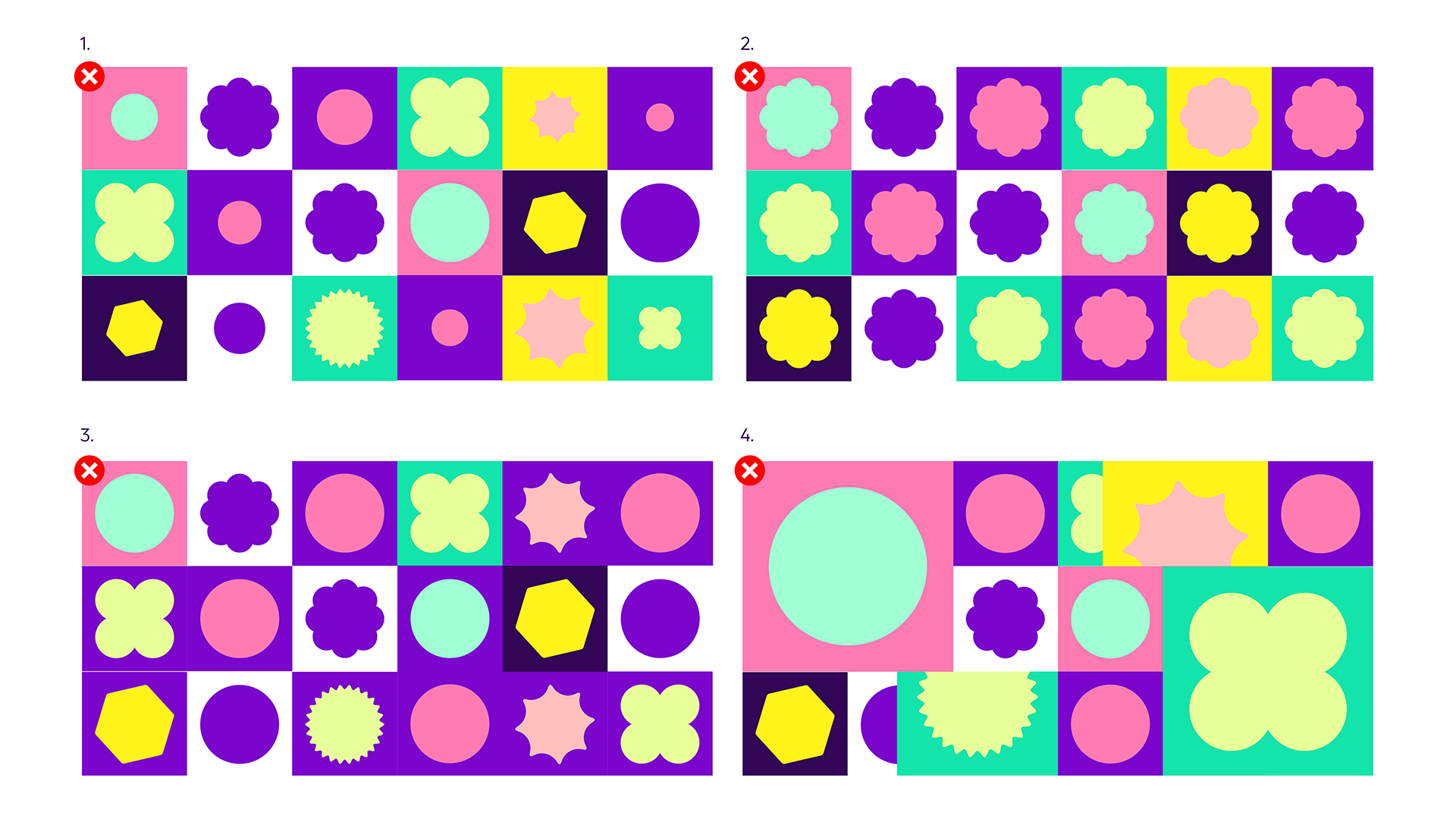
To keep the super graphic consistent and on brand, do not:
- vary the size of the Flourish within the gridded squares
- repeat the same Flourish shape within the gridded squares
- use the same colour for the majority of gridded squares. Make sure there is an even spread
- overlap the gridded squares
Super graphic examples with images

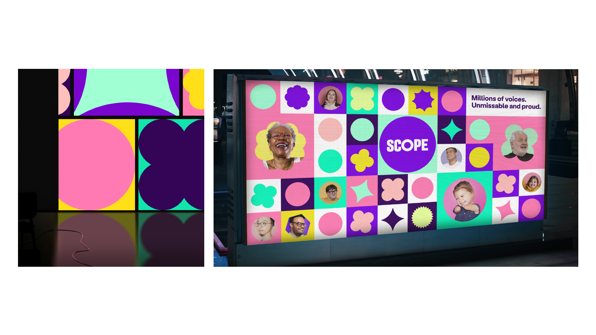
These guidelines have been created to show how the Scope brand should be used in any given situation. The individual images are examples only and may not be used in creative work.
If there is an image you want to use, please contact the Brand and Marketing team. They will then either provide you with a licensed version or suggest a suitable alternative.

