- Home
- Brand guidelines
- Guidelines
- Brand assets
- Iconography
Icon style
Our icons always sit in a yellow circle to allow for easy navigation and clear signposting.
Our icon style complements our typeface, bold and friendly with simple linework.
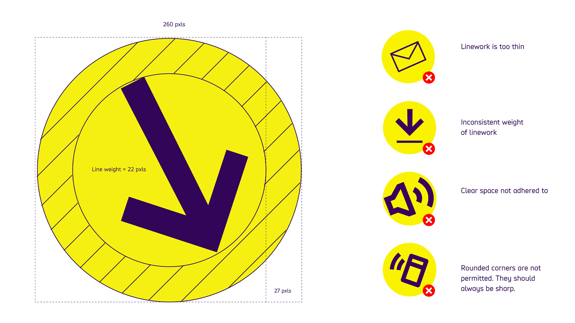
The linework has a consistently bold feel to it, and the specific weight is 22pixels.
Do not use:
- linework that's too thin
- inconsistent linework weights
- less clear space than 27 pixels
- rounded corners. They should always be sharp.
Functional icons
Our functional icons provide a strong visual call to action and are a distinctive element of our brand system. They can be used in both digital and print environments.
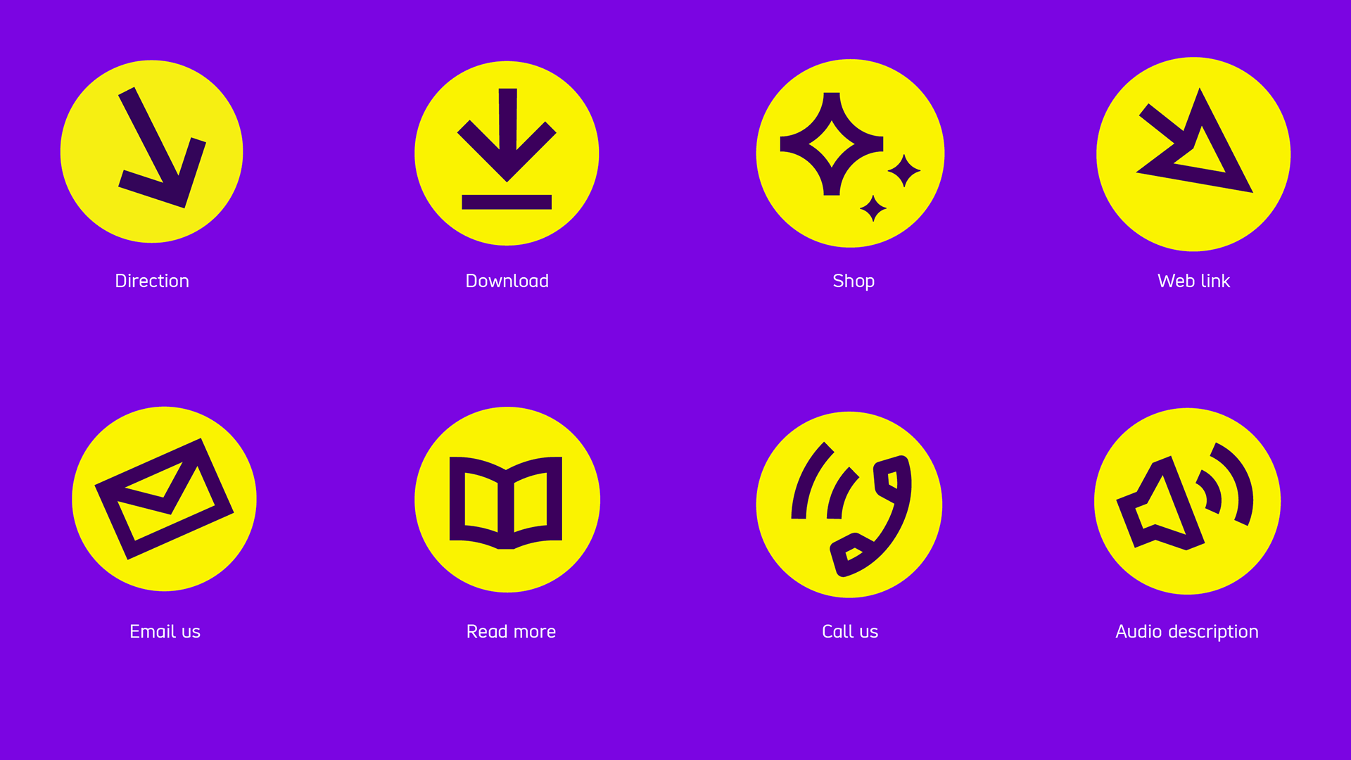
Examples of functional icons include:
- direction
- download
- shop
- web link
- email us
- read more
- call us
- audio description
Icons in use
Our functional icons are flexible in the way they are used. We can use them at small scale, locked up to a lozenge, like a web button.
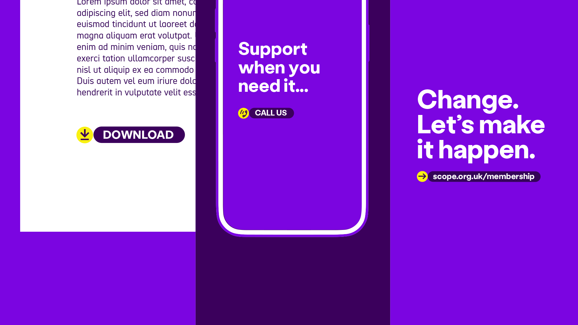
For example, we might have:
- the 'download' icon sitting next to a download button.
- the phone 'call us' icon next to a call us button.
- the arrow 'direction' icon next to a button with our website URL
Creative use
We can also use them more creatively. The icon becomes the main graphic element.

In these icons, illustrations 'break out' of the circle.
When scaling icons up or down, please make sure the stroke weight is set to also scale up or down.
Note: Only use one 'creative use icon' at any one time, for clarity of message
Creative use examples
Here are some examples of function icons used 'creatively'.
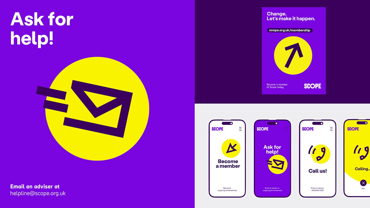
We can use our icons as the focal point, like having the email icon as a large central image to represent emailing our helpline. Or a large arrow pointing at our website URL with different calls to action.
For example, having the text 'Change. Let's make it happen'. Then the direction icon pointing to our membership sign up page.
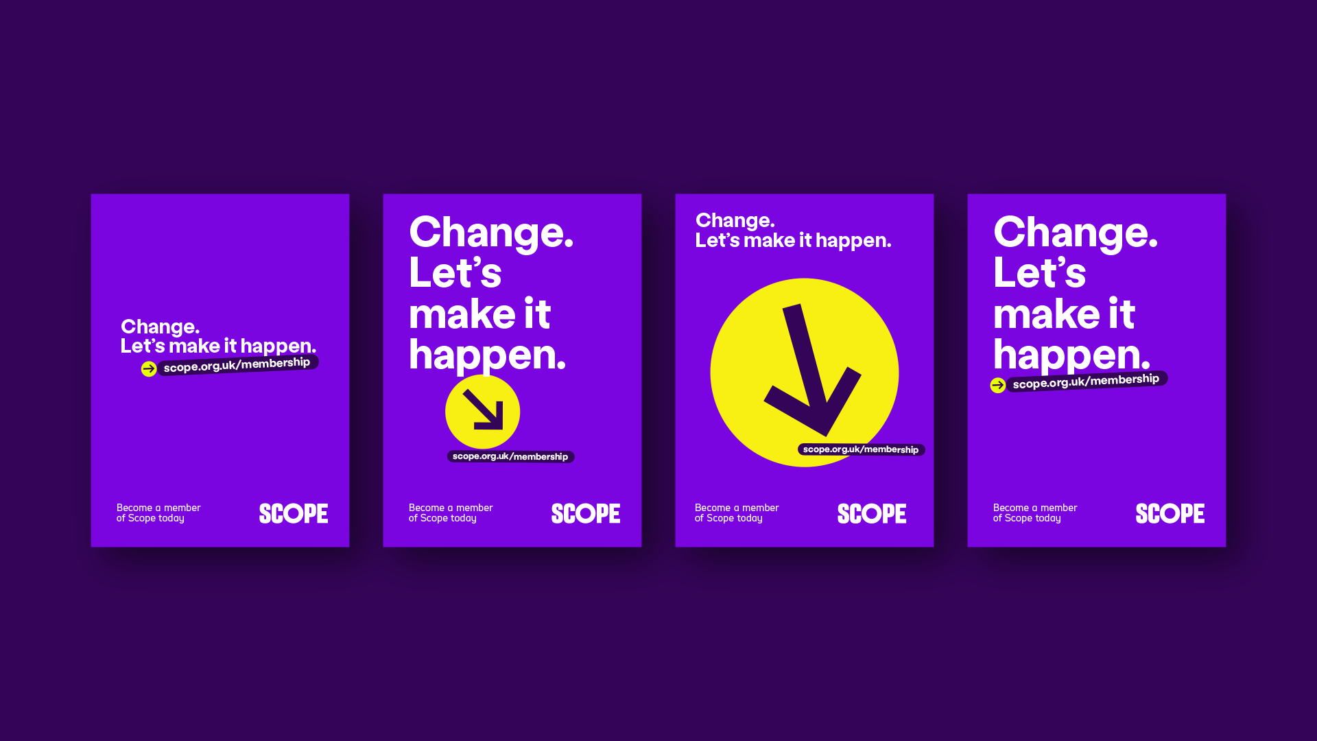
Expressive iconography
Expressive iconography uses exactly the same style as 'creative use' functional iconography. The linework can 'break out' of the yellow circle.

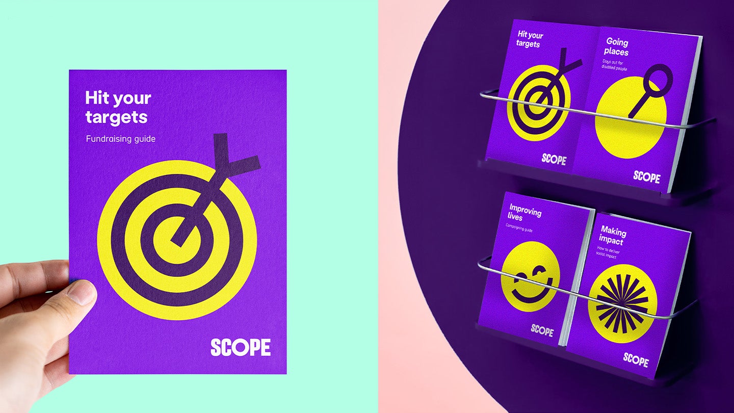
Expressive iconography is used to communicate messaging in a fun and vibrant way. It's not used to show a specific call to action.
For example, we might have 'Hit your targets, fundraising guide' with a break out bullseye icon.
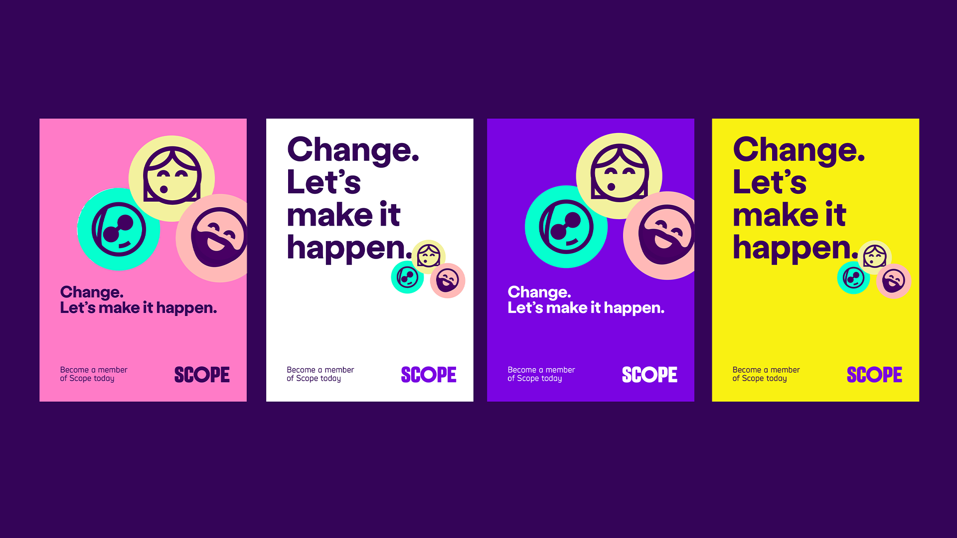
We could also have 'Change. Let's make it happen' with a group of our faces icons.
