- Home
- Brand guidelines
- Guidelines
- Brand assets
- Illustration
We do not have a house illustration style. But our illustrations do always appear in our brand colours.
Illustration should be used for longer articles only, not for one off pieces of communication. Use the same illustration style across a single article.
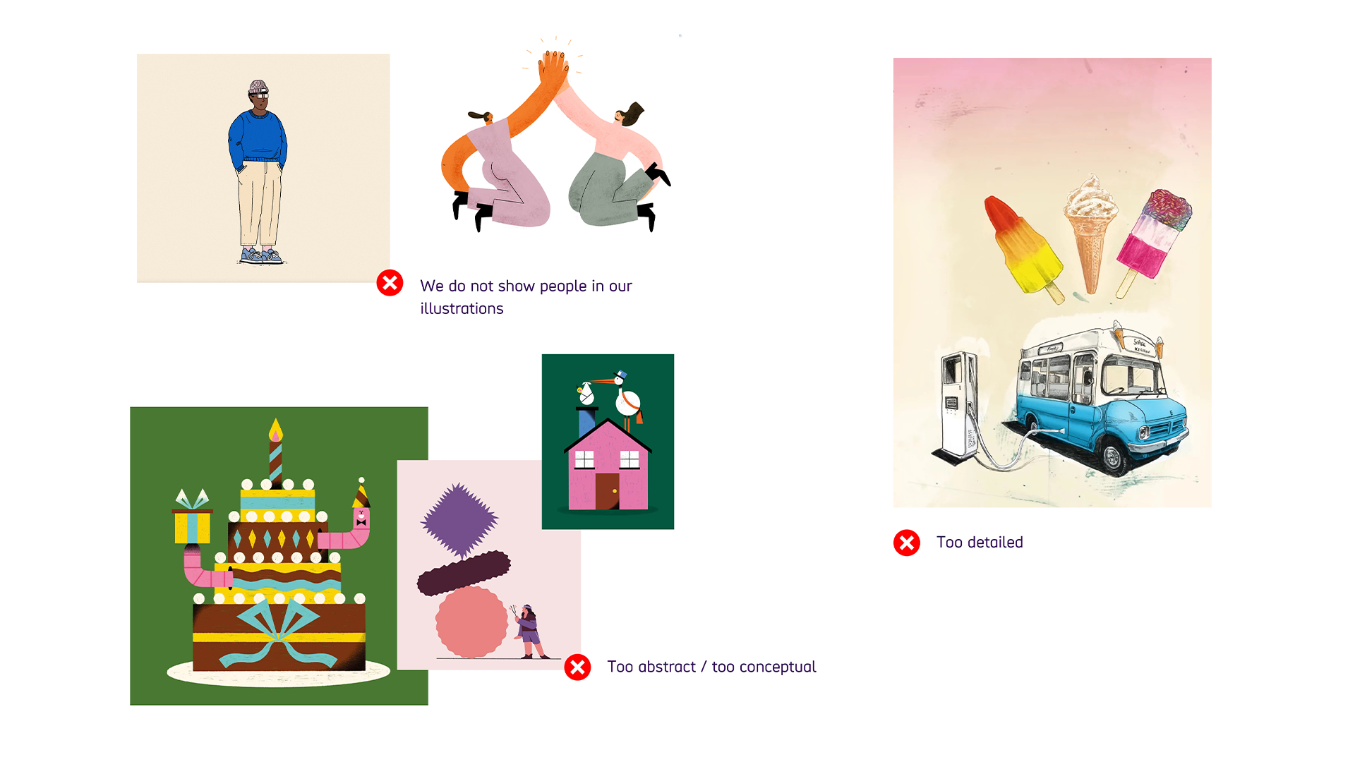
We avoid showing people in our illustrations, we use real life photography for that.

-
Image description
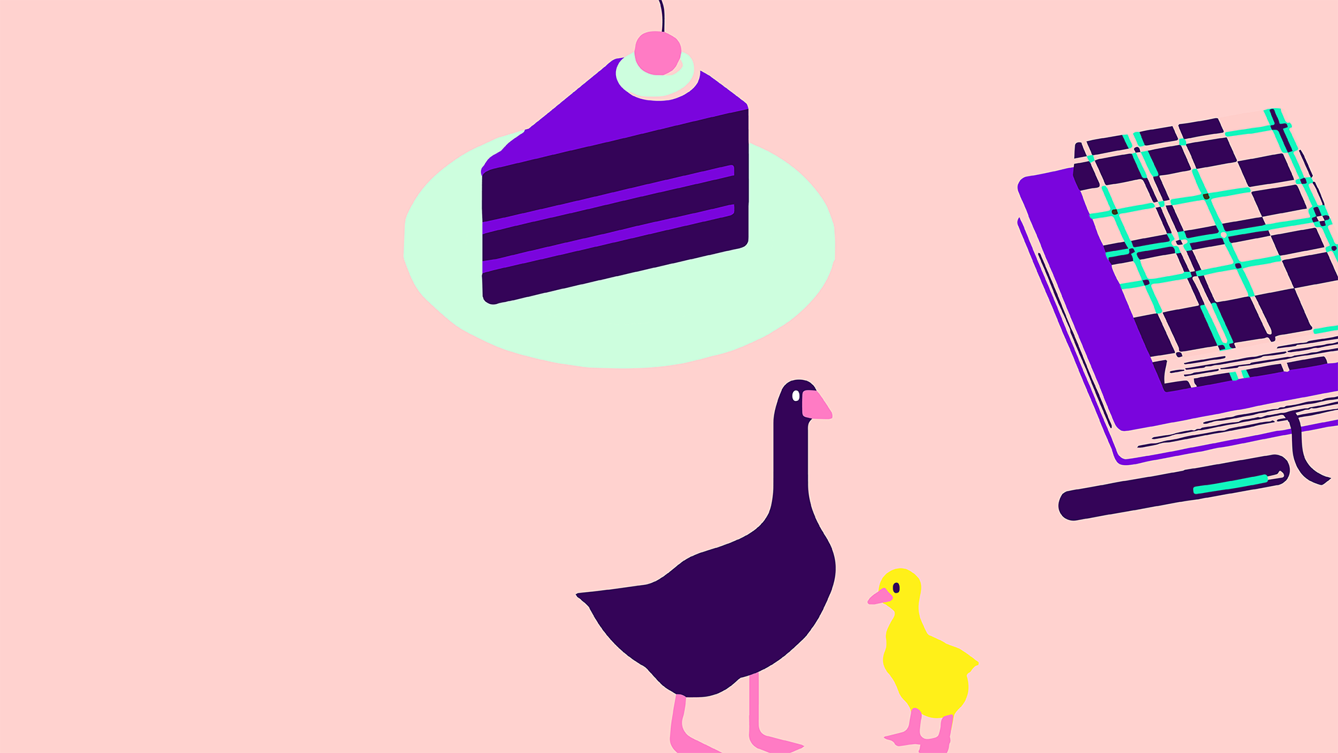
Illustration 1 is a Dark Purple slice of cake, using Bright Purple for 2 layers of icing and the topping. There is Bright Pink cherry and Pastel Green icing on top, and a Pastel Green circle underneath. It uses block colours without detail.
Illustration 2 has ducks, one Dark Purple and one Bright Yellow and different sizes. Both have Bright Pink feet and beaks. No detail but block colours.
Illustration 3 is 2 notebooks and a pen. They use Bright Purple, Dark Purple, Pastel Pink and Bright Green. One notebook has a check pattern. Simple detail and block colours.
Using colour
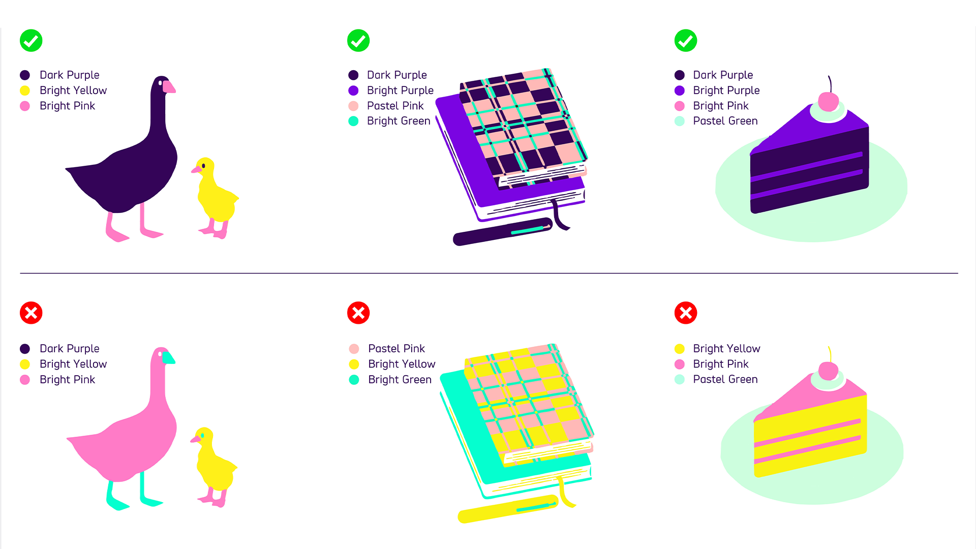
Always make sure the illustration uses either Dark Purple or Bright Purple. We can use purple with our other brand colours. For example, an illustration might use:
- Dark Purple, Bright Yellow, Bright Pink
- Dark Purple, Bright Purple, Pastel Pink, Bright Green
- Dark Purple, Bright Purple, Bright Pink, Pastel Green
We do not create illustrations that only use our supporting palette and Bright Yellow. For example:
- Bright Green, Bright Yellow, Bright Pink
- Pastel Pink, Bright Yellow, Bright Green
- Bright Yellow, Bright Pink, Pastel Green
Examples of these colour combinations are shown in the illustrations below:

-
Image description
Examples of do's and don'ts with illustration colour usage.
Example 1 is of 2 ducks. Correct use of colour has one Dark Purple and one Bright Yellow, both have Bright Pink feet and beaks. Incorrect colour use has Bright Pink for the body and Bright Green for the legs and eye.
Example 2 shows 2 notebooks. Correct colour use has one Bright Purple notebook, the other has checked Dark Purple, Pastel Pink with Bright Green lines. There is a Dark Purple pen with a Bright Green line. Incorrect colour use has one Bright Green book, with the other checked book using Bright Yellow, Pastel Pink,and Bright Green lines. Pen is Bright Yellow and Bright Green.
Example 3 shows a slice of cake. Correct use of colour has a Dark Purple sponge and Bright Purple layers of icing and topping. The incorrect example shows Bright Yellow cake and Bright Pink icing.
These guidelines have been created to show how the Scope brand should be used in any given situation. The individual images are examples only and may not be used in creative work.
If there is an image you want to use, please contact the Brand and Marketing team. They will then either provide you with a licensed version or suggest a suitable alternative.
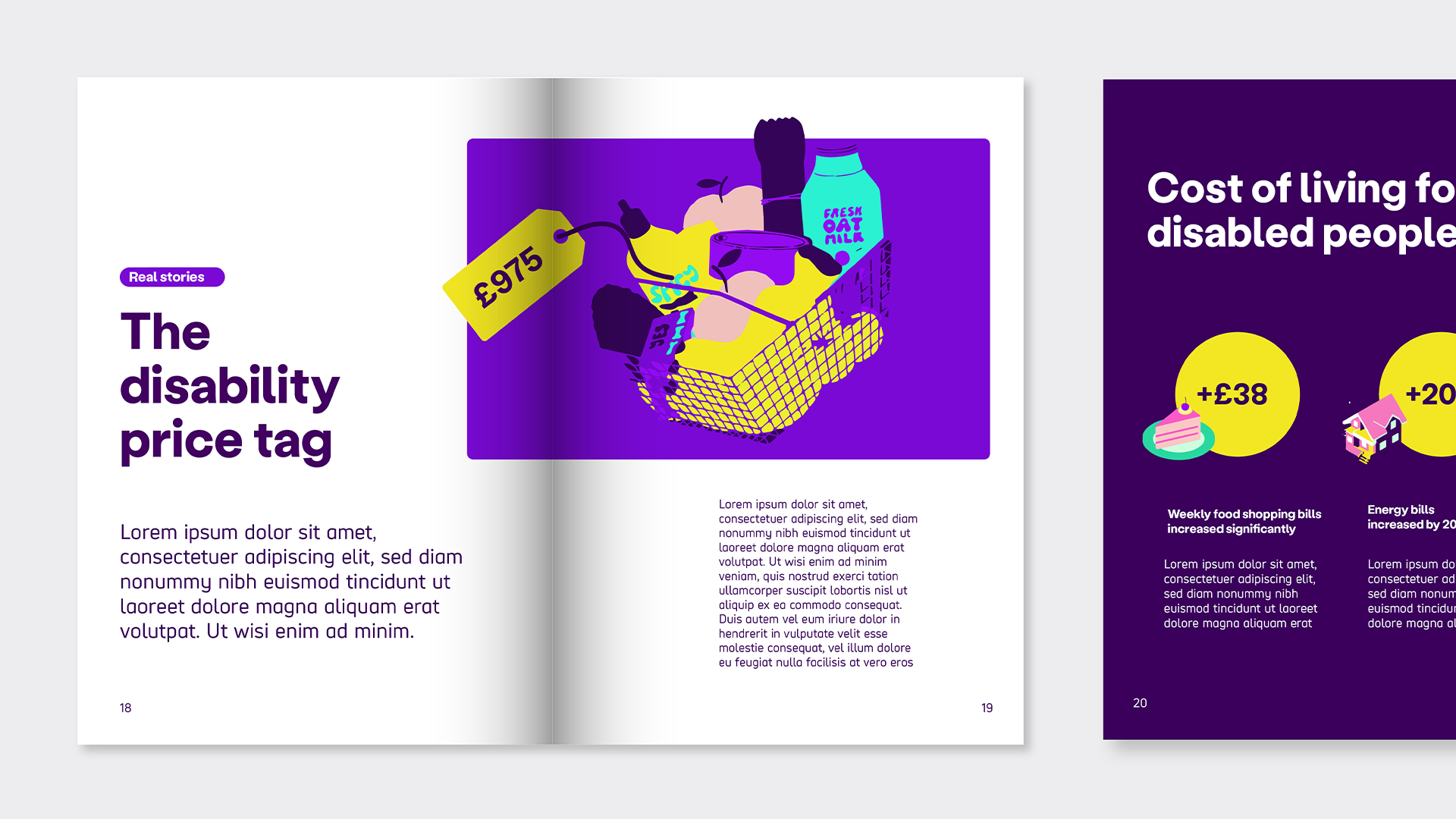
Illustrations in layouts
The examples below show how we apply illustration to our layouts. They can be a large feature image or they can be used as smaller supporting visuals.


