- Home
- Brand guidelines
- Guidelines
- Brand assets
- Infographics
An infographic is a visual representation of information or data. For example, a chart or diagram.
Our infographics are always:
- bold
- as simple as possible
- colourful and immediate
- accessible
They often become the focal point of any layout.

Note: Always make sure the statistics are readable without relying on the graphic elements. For example, you can read the numbers without needing the shapes to understand the information.
Infographics are visual rather than technical, so should look simple and beautiful. If you need a more technical representation, use a chart or graph. Find our guidance under the heading 'charts and graphs'.
-
Image description
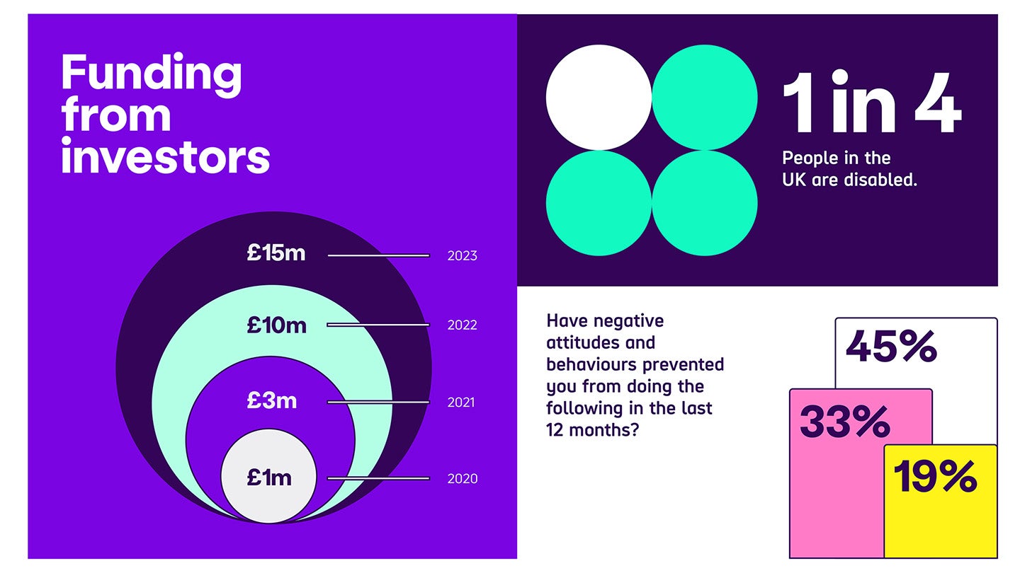
Example 1 has 'funding from investors' graphic with 4 circles in different brand colours cascading out showing the income £1 million, £3 million, £10 million and £15 million each year between 2020 and 2023.
Example 2 has 4 circles creating a square, with one white and 3 Bright Green. Text says '1 in 4 people in the UK are disabled'.
Example 3 has text saying 'have negative attitudes and behaviours prevented you from doing the following in the last 12 months? There are 3 bar charts over lapping in height, with 19%, 33%, and 45%, using White, Bright Pink and Bright Yellow brand colours and Dark Purple text.
Examples
Here are some examples of how infographics are integrated into our communications:

-
Image description
Example 1 has a large heading on the left page saying 'how negative attitudes and behaviours have affected disabled people...' There's body text underneath. On the right page, there's 3 overlapping bars. They increase in size and have different colours. The smallest shows 19%, the middle 33%, the largest 45%.
Example 2 is a booklet format. There is a heading on the top left page with text that says 'what would be helpful in aiding you to live independently?'. The top right page has the body copy. The infographic spans both pages on the lower part of the booklet. It has 2 long bars showing different percentages in different colours
Example 3 has a heading 'funding from investors' and body copy on the left page. On the right is 4 circles in different brand colours cascading out to show the income between 2020 and 2023. There's a small paragraph at the top left of the second page.
Graphs and charts
Graphs and charts are used to show more detailed statistics than our infographics.
Because of this, colour contrast is essential for understanding the data.
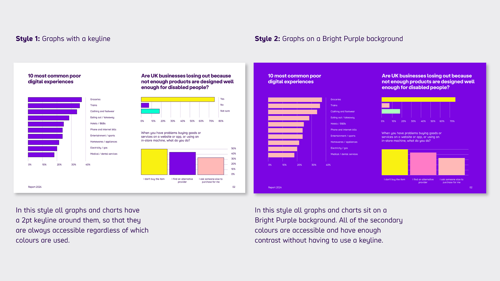
There are a choice of 2 styles that you can use to create graphs and charts. These allow for maximum readability and accessibility.

Style 1: graphs with a border
In this style, all graphs and charts have a 2pt border around them. This makes sure they are always accessible, regardless of which colours you use.
Style 2: graphs on a Bright Purple background
In this style, all graphs and charts sit on a Bright Purple background. All of the secondary colours are accessible. They have enough contrast without having to use a border.

