- Home
- Brand guidelines
- Guidelines
- Brand assets
- Logo and tagline
Master logo
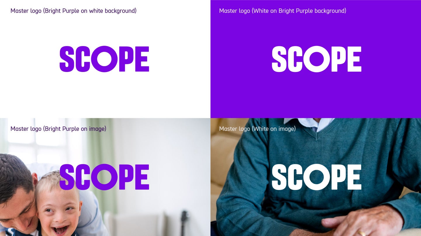
This is our primary logo, and should be used in the majority of instances. Where possible it should be in either Bright Purple or White.
-
Image description
4 examples of Scope's logo in use.
Example 1 is Bright Purple logo on white background.
Example 2 is our white logo on bright purple background.
Example 3 is our Bright Purple logo over a photograph with a father and son, the 'S' is placed slightly over the son's head, with the rest of the logo over a blurred white wall in the background.
Example 4 has a torso of an older man in dark teal jumper with our white logo sitting in the centre across his chest."
If the logo is being placed on top of an image, select the logo colour with the highest contrast.

Secondary logo
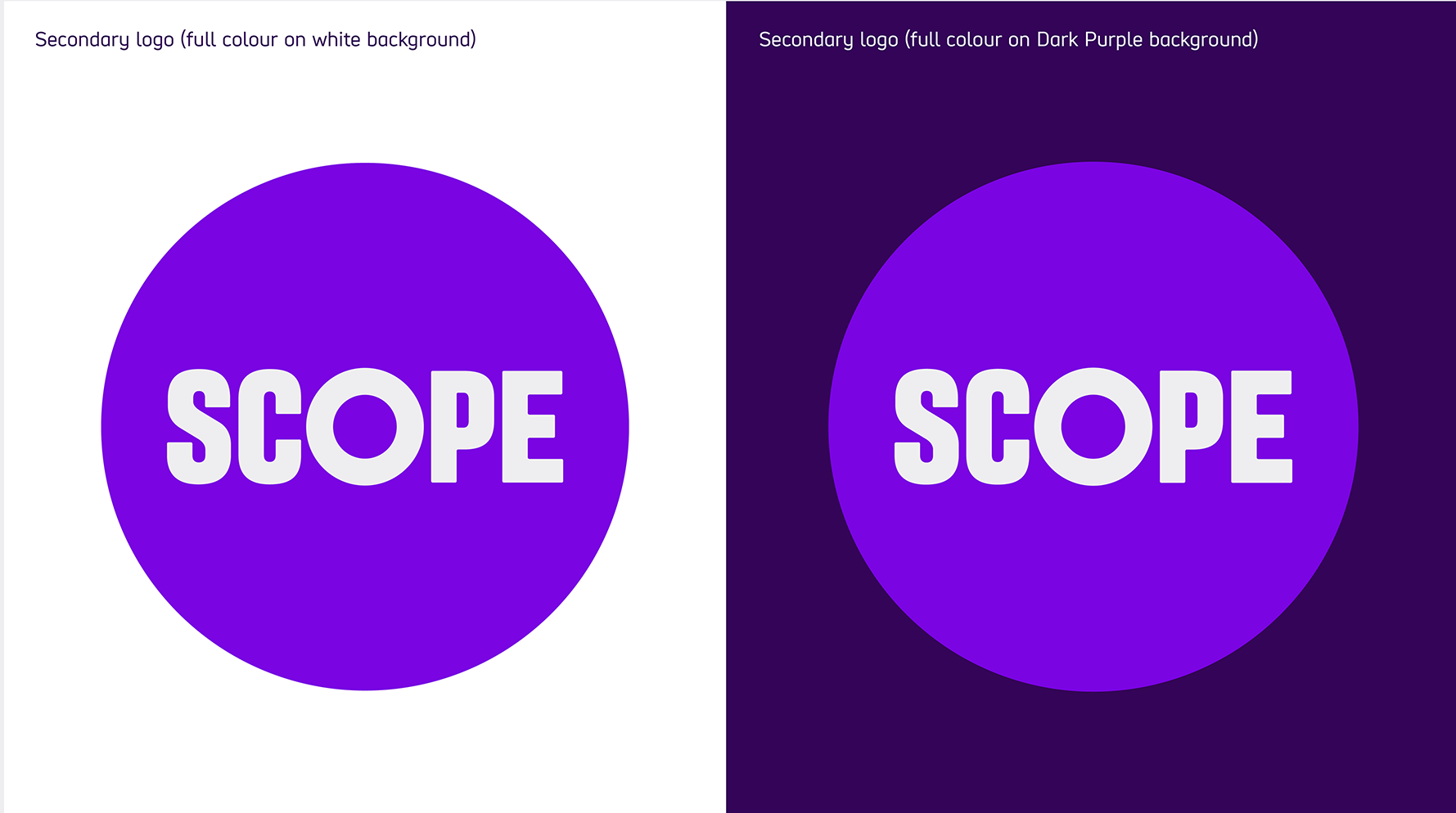
This is our secondary 'limited use' logo. It should be only used where there are a limited number other brand assets present.
For example on
- business cards
- email signatures
- one off physical branded items, such as the donation box
Logo mono version
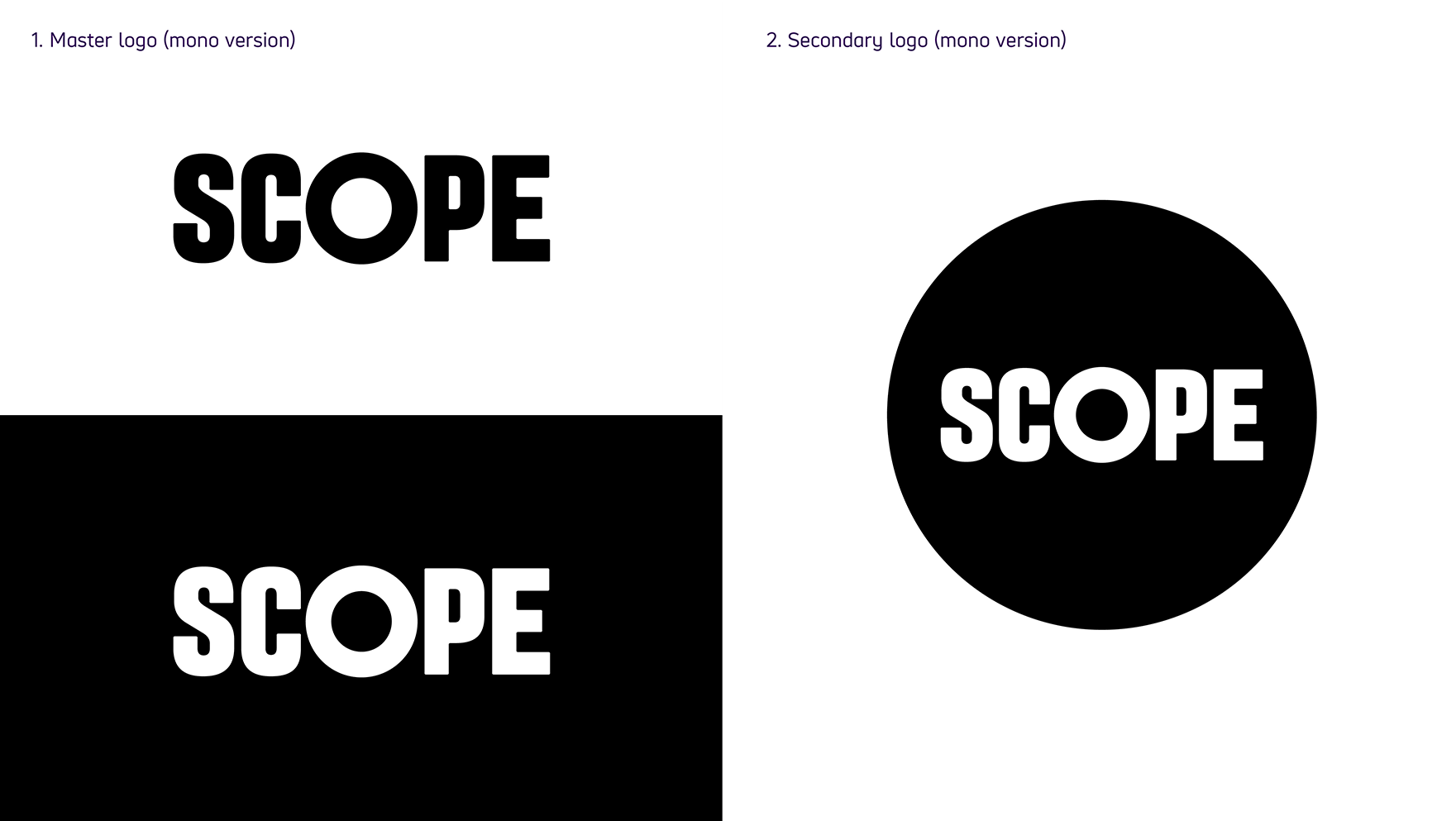
The mono versions of our logos shown above should only be used where colour is not available. For example in black and white print.
Logo construction
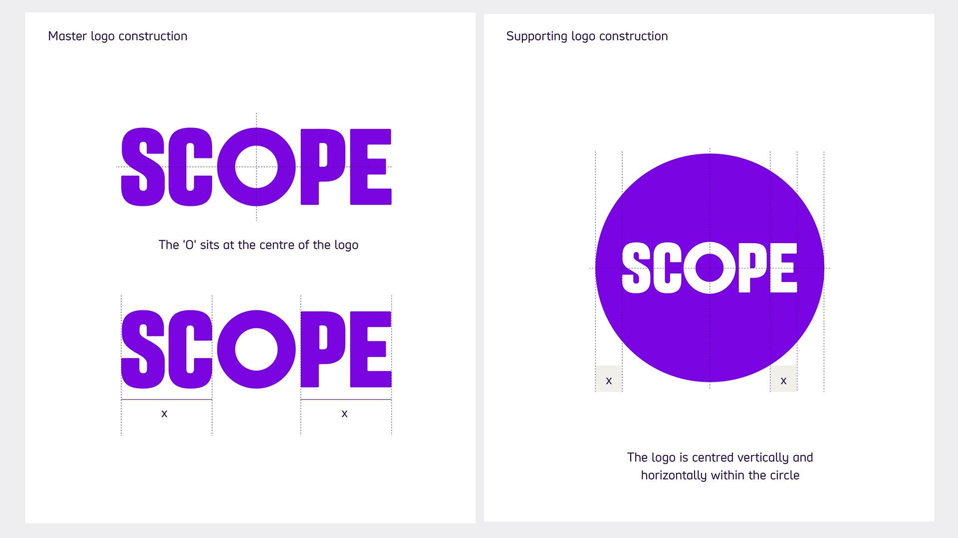
Our logos have been carefully constructed. The 'O' sits exactly in the middle for complete balance and symmetry. It’s also a nod to the fact that the disabled community are at the heart of our organisation and must always take centre stage.
Logo clear space and minimum size
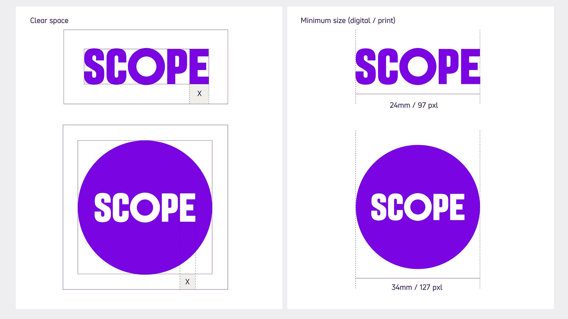
Clear space
The clear space is equal to the width of the 'E' in our master logo.
Minimum size
The minimum size for our master logo is 24mm (97 pixels) wide.
Our secondary logo should be no smaller than 34mm (127 pixels).
Tagline
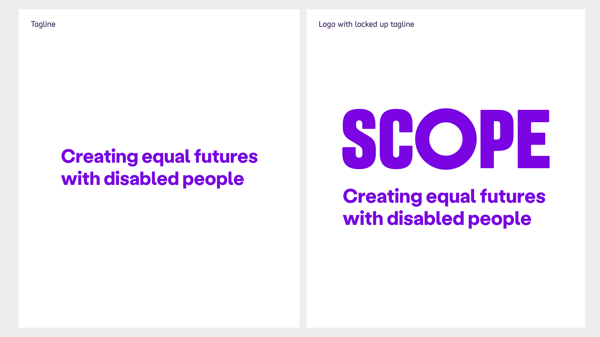
Our tagline exists to explain our mission as a charity at a glance. It works with our logo but can also be used on its own.
Generally, it’s not used in a set position in relation to the logo and can be placed as needed. In some cases, you can place the 2 together (known as a lockup) for maximum impact in a smaller space. But this is the exception rather than the rule.
It can be resized to fit the use it’s being put to. For example, it could be used small at the bottom of a flyer or leaflet, or large on the back cover of a report or t-shirt.
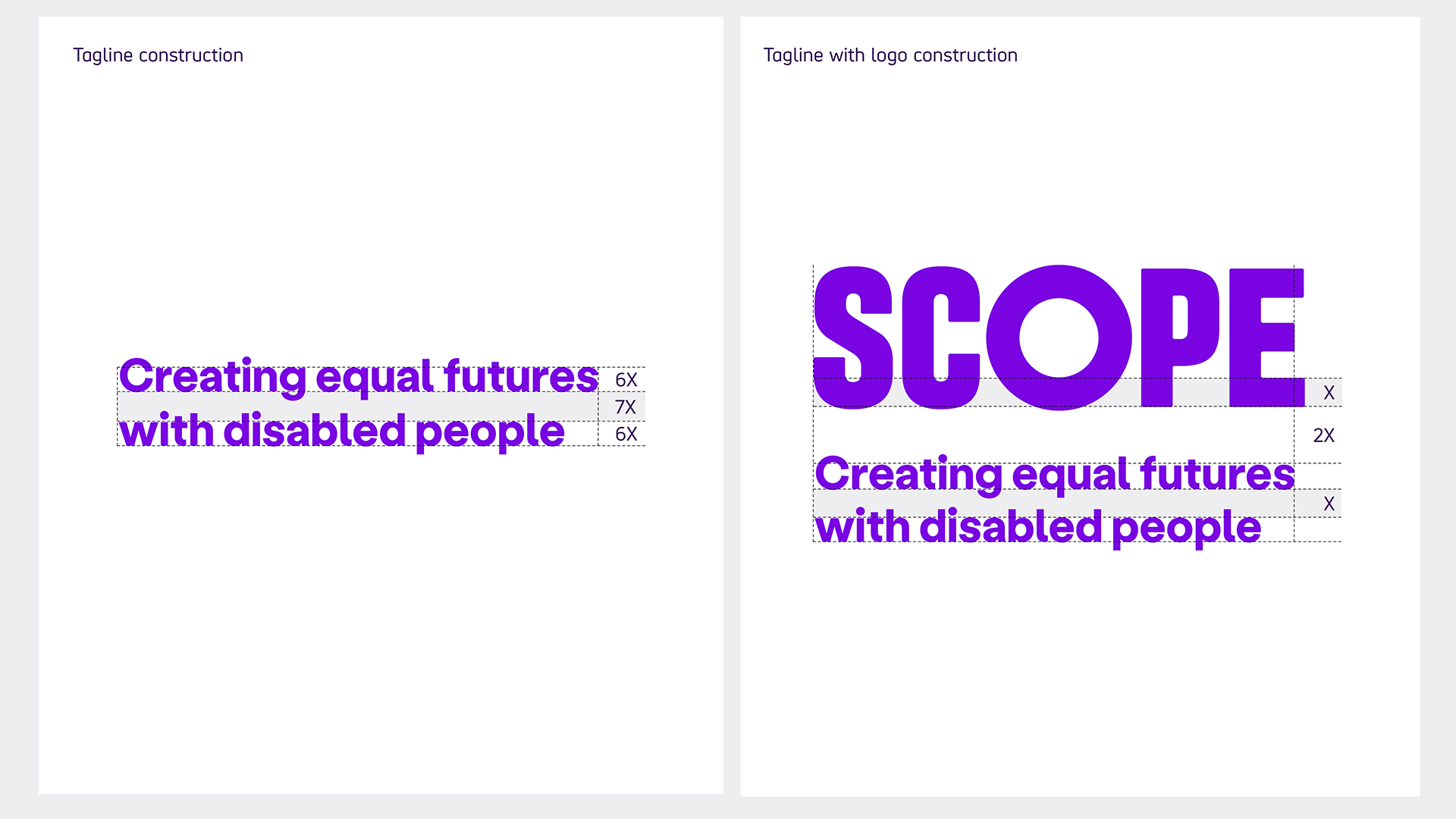
Tagline construction
Clear space
When broken into 2 lines, the clear space between the lines should be enough to make sure no characters interact. We work this out using a formula. If the height of the text is 6x, the distance between the lines is 7x.
For example, if the text is 12pt, the spacing should be 14pt because 12/6 = 2 and then 2x7= 14.
If the text was 18pt, the spacing should be 21pt because 18/6 = 3 then 3x7= 21.
Lockup spacing
When placed with the logo, the gap should be twice the thickness of the lower horizontal lines of the "e" in the Scope logo. This is marked as 'x' in the example. This gap is measured between the bottom of the logo and top of the lower-case characters of the tagline.
The gap between the lines of the tagline should be the same as 'x'.
Using the logo and tagline together
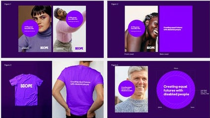
Here are some recommended examples of how we can use our tagline more freely.
-
Image description
Figure 1 shows the preferred tagline placement when used on the front of a brochure. The size of the tagline is established from the logo and tagline lockup artwork proportions.
Figures 2 and 3 show how the tagline can be given central placement on the back cover of a brochure and the back of merchandise.
Figure 4 shows how to use live type to create our tagline within an Amplification Circle, on the front of an A4 brochure cover.
Logo adaptability
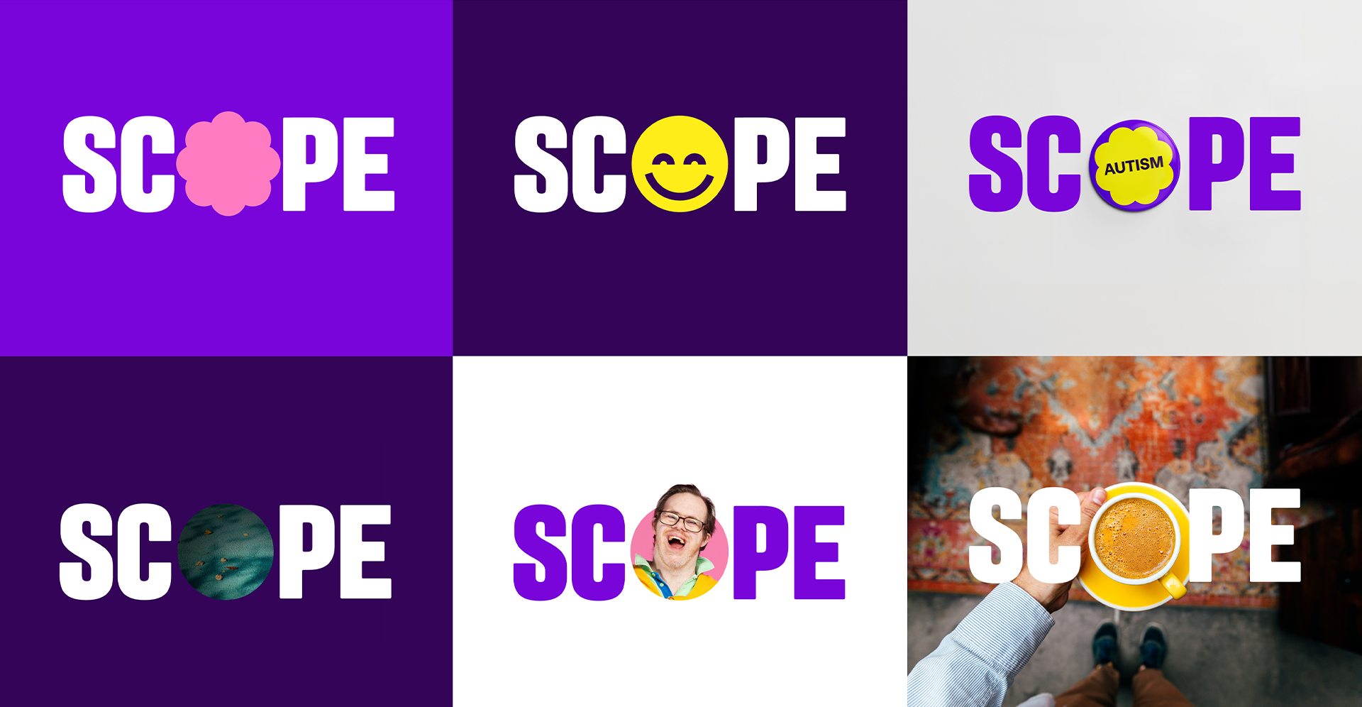
The 'O' at the heart of our logo always represents the ‘space for amplification’. At times it can adapt to express individuality, the unique perspectives of the disabled community and Scope’s place in the everyday world.
Graphic shapes, 3D objects, photography and even film footage can be used to create adaptability within our logo.
The 'O' at the heart of our logo can also be expressed in more abstract ways. This integration of logo and imagery would be particularly successful in motion.
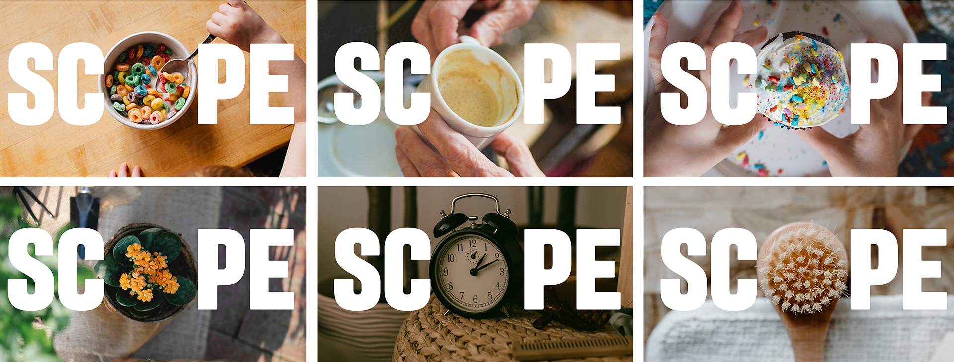
You must make sure that contrast levels are accessible across the whole image. This applies when placing the tagline, logo or their elements over any photograph. If they are not, consider darkening the image or adding a drop-shadow and re-test the contrast.
These guidelines show how the Scope brand should be used in any given situation. The individual images are examples only and may not be used in creative work. If there is an image you want to use, please contact the Brand and Marketing team. They will provide you with a licensed version or suggest a suitable alternative.
Primary logo placement and sizing
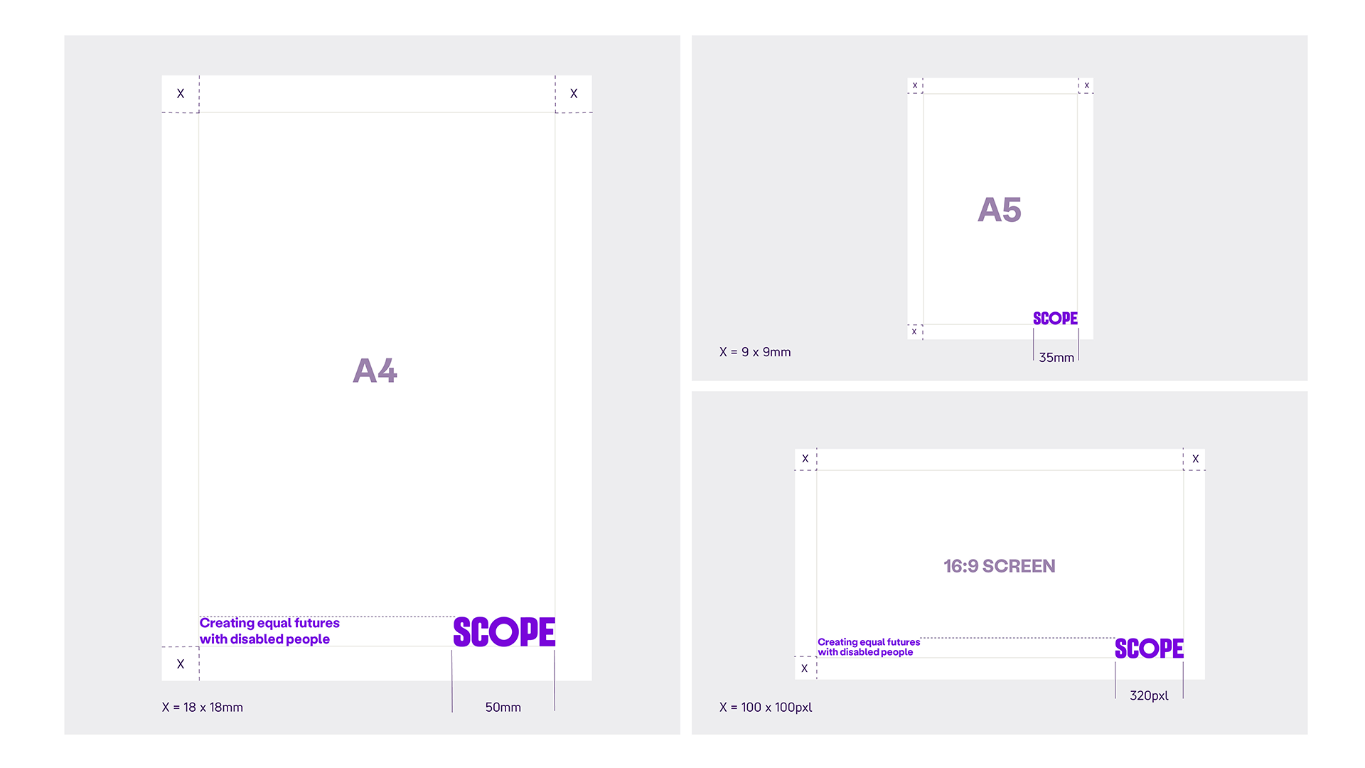
Where possible, we place our master logo on the bottom right. We use it with a confident width of:
- 50mm (A4)
- 35mm (A5)
- 320 pixels (PowerPoint widescreen 16:9)
The logo sits in square margins of:
- 18mm by 18mm (A4)
- 9mm by 9mm (A5)
- 100 pixels by 100 pixels (PowerPoint widescreen 16:9)
When the logo is in the bottom right, our tagline can sit on bottom left next to the logo. The size of the tagline is established from the logo and tagline lockup artwork proportions. Please heading tagline construction.
If you're producing a report or other longer document, the tagline is unlikely to feature on every page. The logo can also be much less prominent to save space and materials.
Selected use logo placement and sizing
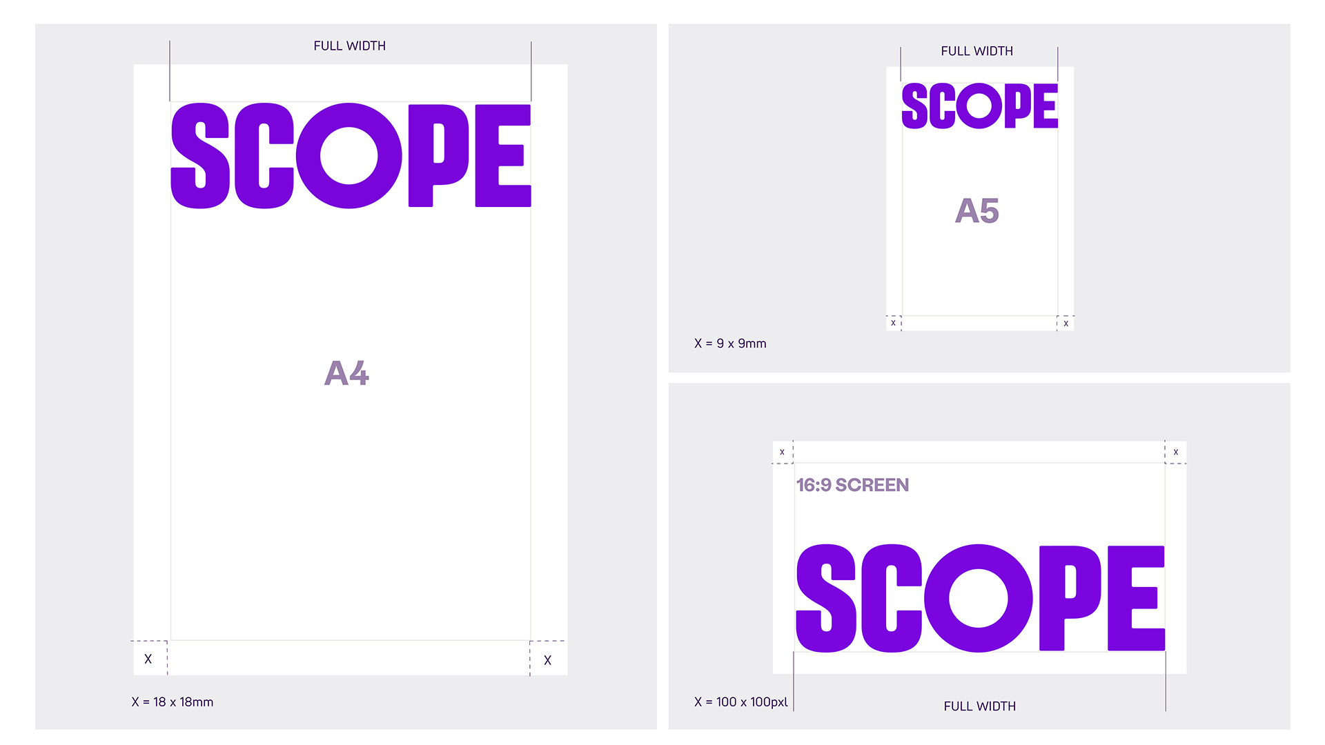
In some instances, we can amplify our name and use our master logo at full width as a bold masthead. This usage may be appropriate for internal comms.
Partnership lock-ups
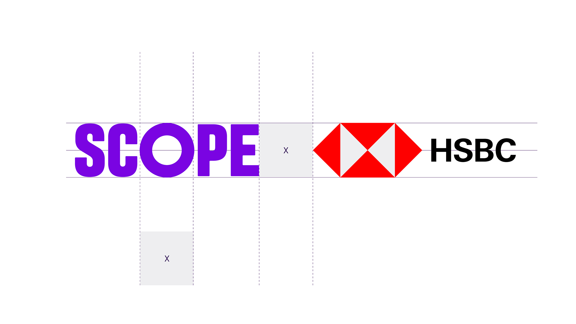
Use our master logo when locking up with partner logos. The space between logos is equal to the width of the 'O' in our logo.
If the company or organisation is partnering or supporting us we add these words to the lock-up.
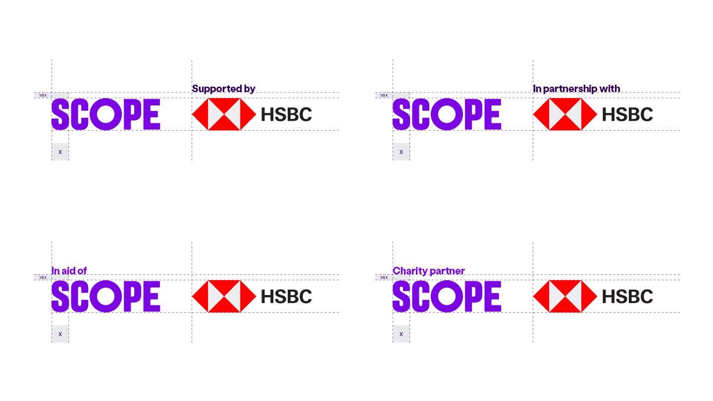
We add 'supported by' and 'in partnership with' above the partner logo. We use 'in aid of' and 'charity partner' above the Scope logo.
The spacing between the wording and logo is 1/3 of X. X is the width of the 'S' of the Scope logo. Text is set at 10pt Labil Grotesk Bold when our stacked logo is set at its minimum size (34mm wide).
Social media avatar and favicon
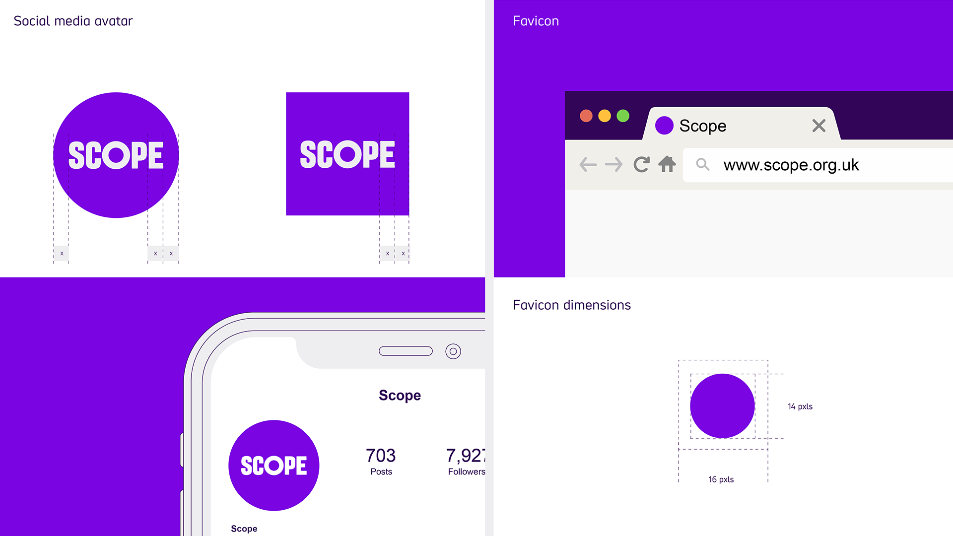
We use our secondary logo as our avatar and the size relationships remain consistent.
Our favicon appears as a single, Bright Purple circle, the purest expression of our brand.
The favicon dimensions are 16pixels by 14pixels.
-
Image description
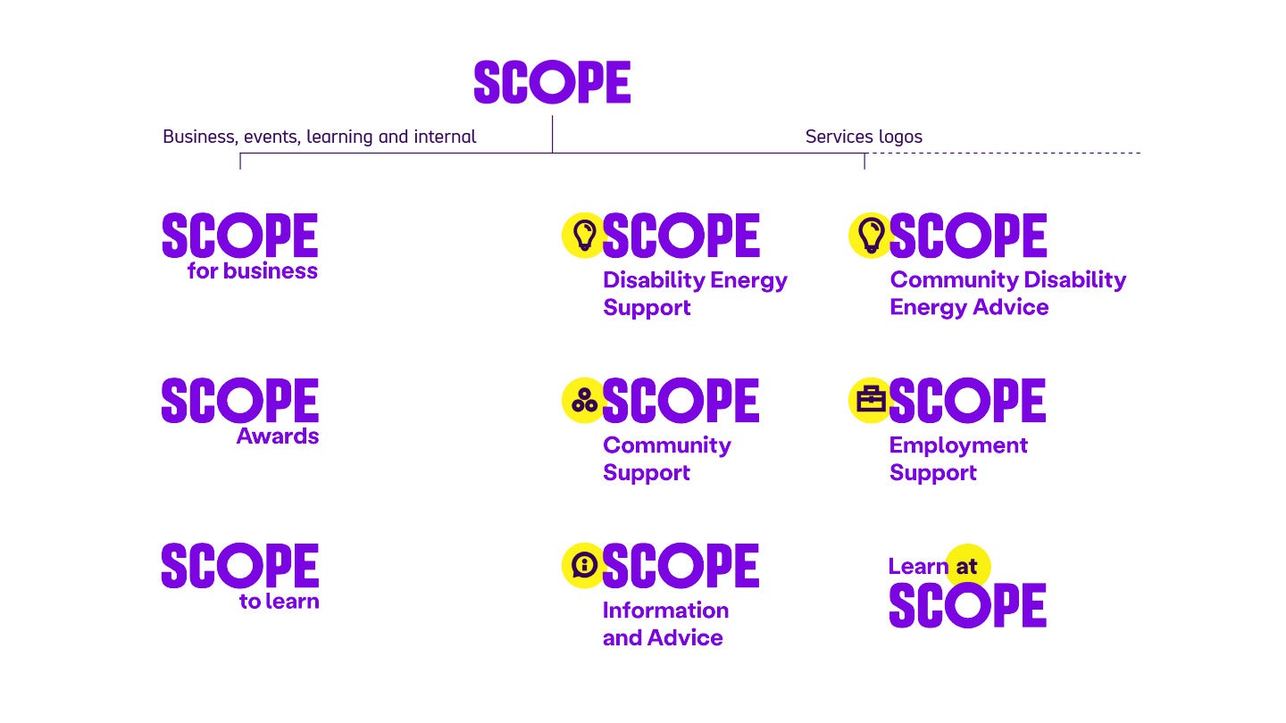
Examples of branded house logos.
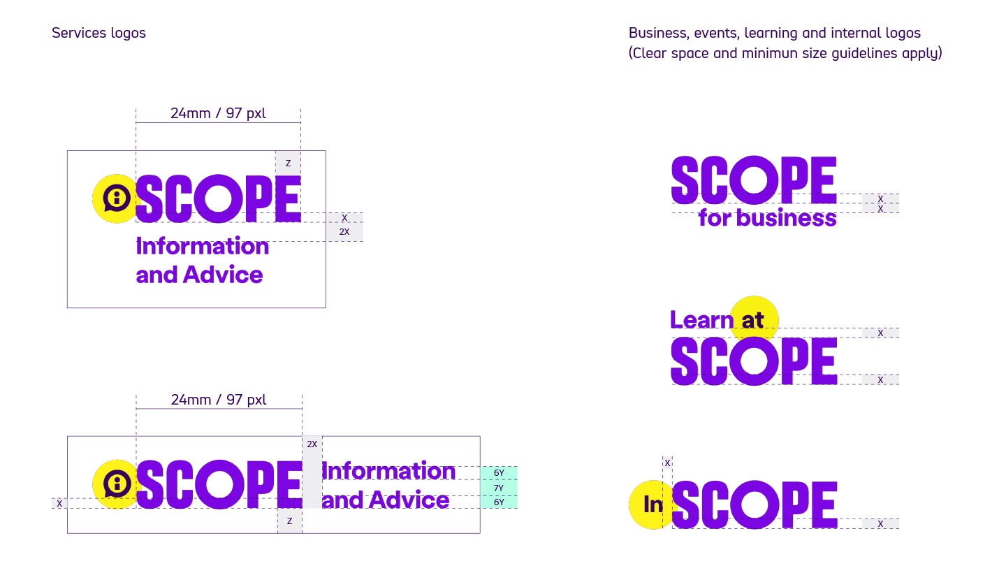
Business, events and learning have the name set to the right side of the logo. For example, Scope logo, then 'for business' underneath set to the right. The last letter of each word line up. Other examples are Scope Awards, and Scope to learn.
Services logos have the Scope logo then the name of the service below, set to the left side. The service names span 2 lines. Examples include Disability Engergy support service, Community Support, Information and Advice, Employment Support, Community Disability Energy Advice. Each one also uses an icon placed offset behind the 'S'.
One service sits above the logo on the left, this is 'Learn at Scope', a yellow amplification circle sits behind the word 'at'. "
For brand recognition, all logos are produced in a branded house style. This means that every logo includes the main Scope logo and follows a set of rules to keep our brand consistent and recognisable.
Only one logo is needed for each piece of communication. For example, if sending an email about the Scope Awards, only use the branded house Scope Awards logo. It does not need the main Scope logo as well.
New logos must not be produced without contacting the Scope Brand and Marketing Team.
Branded house construction
Construction
Our branded house logos have consistent spacing and use the thickness of the lower horizontal of the "e" in the Scope logo, marked here as 'x'. The diagrams on the right show how this spacing is used.
Clear space
The clear space is equal to the width of the 'E' in our master Scope logo. Marked here as 'z'.
When broken into 2 lines, the clear space between the lines should be enough to make sure no characters interact. We work this out using a formula. If the height of the text is 6y, the distance between the lines is 7y.
For example, if the text is 12pt, the spacing should be 14pt because 12/6 = 2 and then 2x7= 14.
If the text was 18pt, the spacing should be 21pt because 18/6 = 3 then 3x7= 21."
Minimum size
The minimum size for our branded house logos is determined by the size of the Scope logo within them.
The Scope logo should always be 24mm (97 pixels) wide
Adding alt text to logos
For infomation on how to add alt text to logos, please visit our alt text guidelines.


