- Home
- Brand guidelines
- Guidelines
- Brand assets
- Typography
Our fonts
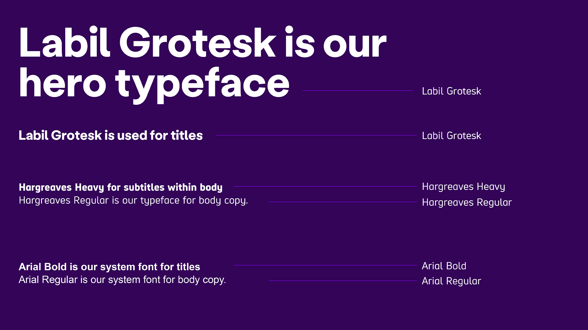
We use Labil Grotesk for all applications where our font can be embedded, such as designed assets and website.
We use it for titles, headlines, key data, direction and exclamations. It provides extra personality, making our content friendly as well as accessible.
We use Hargreaves Regular for all of our body text. For subtitles that sit within body copy, we use Hargreaves Heavy.
Arial is our system font and is used when creating live open source documents, such as PowerPoint and Word. We use Arial Bold for titles and Arial Regular for body copy.
Hero typography: Labil Grotesk
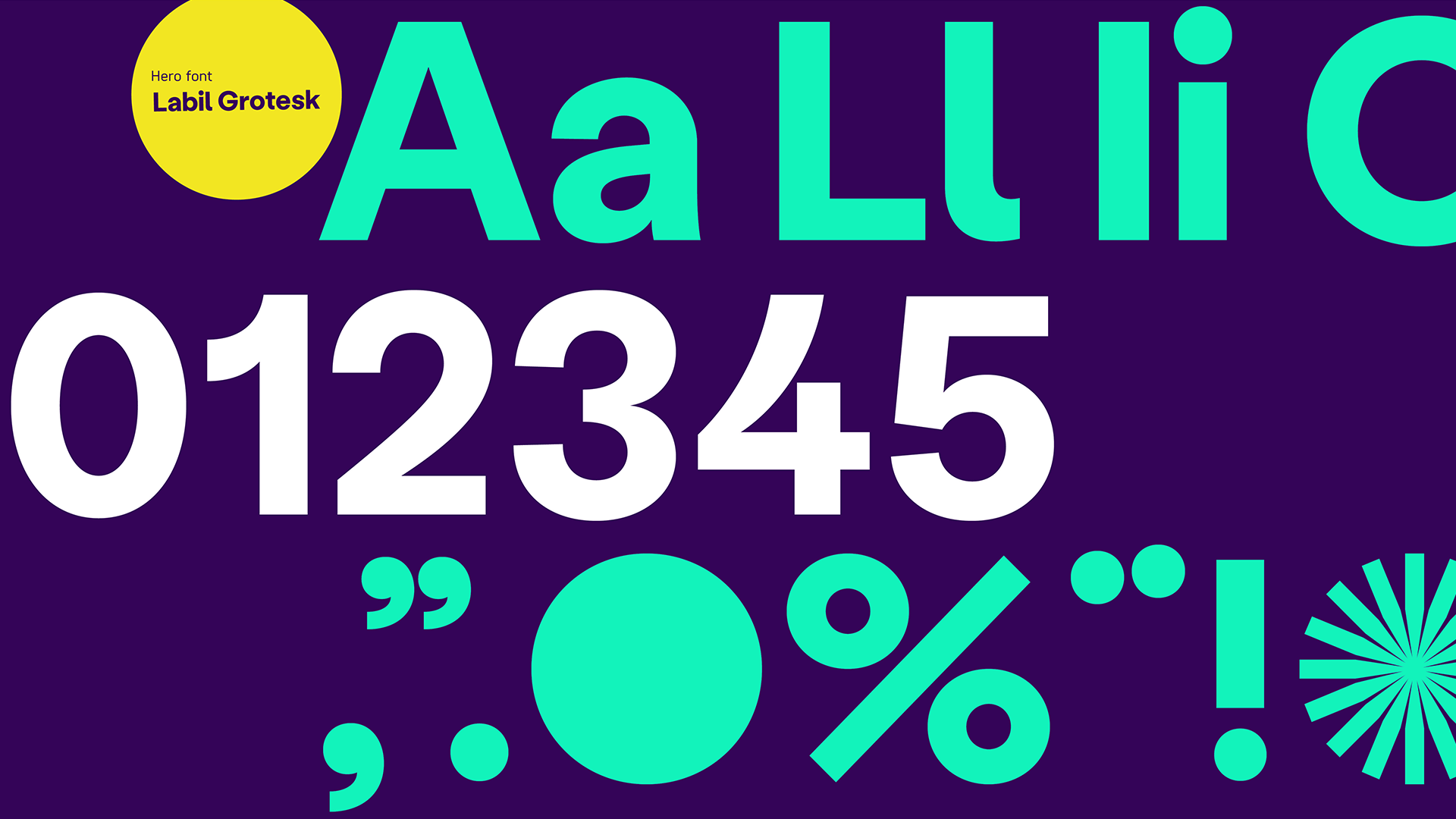
Labil Grotesk is distinctive and friendly. It has circular characters and bold geometrical framework.
It is recognisable and has clear, highly legible upper and lowercase characters. There is good differentiation between easily confused characters, such as 1 and I, L and l.
Line spacing
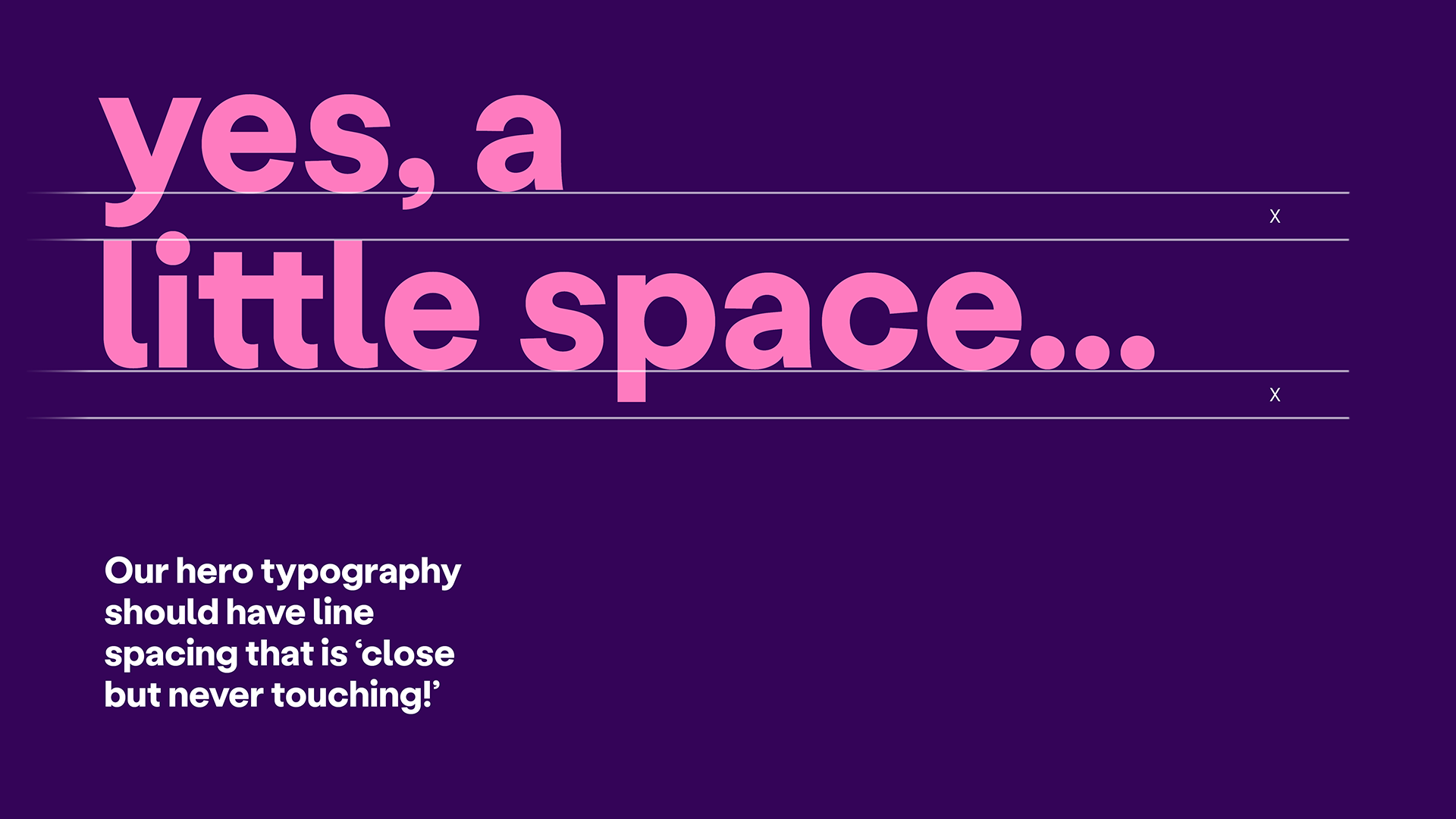
Our hero typeface looks best when the leading is set slightly smaller than its default.
Since the spacing will vary from touchpoint to touchpoint we have established the rule of 'close but never touching'. If any of the characters touch, we need to increase the spacing.
Supporting typefaces: Hargreaves Regular
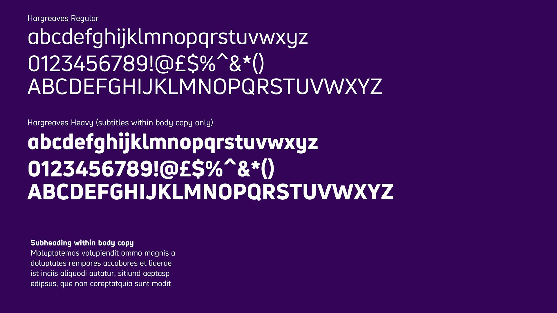
Body copy
Hargreaves has been specially designed to maximise legibility. Hargreaves Regular should be used for all body copy content.
Subtitles within body copy
On occasion where more impact is needed, you can use Hargreaves Heavy to accentuate words but this must be limited to short amounts of text.
Font size
- 12pt minimum for printed content
(PDFs, letters, posters, leaflets) - 14pt minimum for digital content
(emails, website) - 18pt for large print for all internal use of fonts must be Arial 14pt for email signatures and out of office replies.
Spacing
As a general rule, the line spacing should be set to the font size +6pt, with 0 tracking for all body copy.
Labil Grotesk and Hargreaves Regular in use
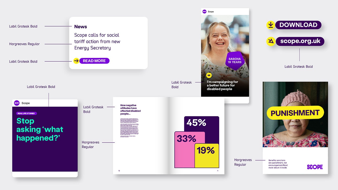
The example below show various instances of Labil Grotesk in use.
We mostly use lowercase because this shows off our curvy and friendly letterforms. When we need to be more proactive and urgent we can use uppercase, which works well in an 'Action Lozenge'.
-
Image description
News item example shows Labil Grotesk in bold for the heading 'news'. Hargreaves regular for the body summary copy and then Labil Grotesk bold in an action lozenge button saying 'read more'.
Labil Grotesk bold is also shown used in:
- social post heading saying "stop asking 'what happened'?"
- Booklet page title saying "how negtive attitudes and behaviours have affected disabled people"
- a social post quote by Scope campaigner
- action lozenge buttons with saying 'download' and 'scope.org.uk'
Hargreaves regular is shown as the body copy on the booklet and a campaign leaflet.
-
Image description
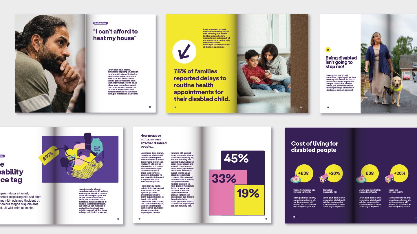
Examples 1 to 3 have full page photography. Opposite pages have a large quotes or statements 'I can't afford to heat my house' and stat '75% of families reported delays to routine health appointments for their disabled child' and 'Being disabled isn't going to stop me'. Each has a small paragraph of body copy.
Examples 4 to 6 show data. The first has the disability price tag with an illustration of a shopping basket and a tag with amount, this is over a 2 page spread and a large title 'the disability price tag'.
The second has a 3 bar chart with different stats on one page and then a full page article on the opposite page. The title is 'how negative attitudes have affected disabled people'.
The last has yellow amplification circles with stats, and uses illustrations overlapping the bottom left of the circle. They span the 2 page spread. Each circle has a paragraph of text.
System typefaces: Arial
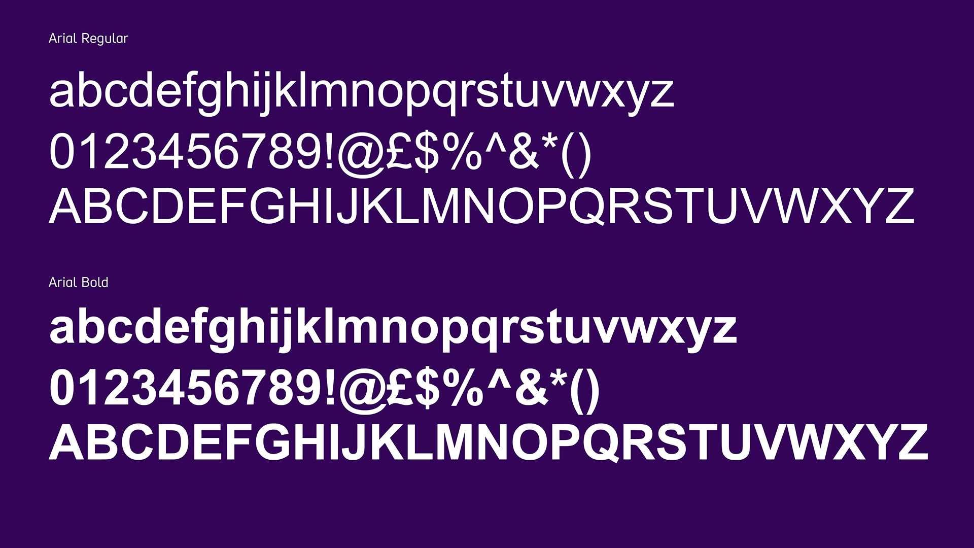
Arial is our systems font. Everyone at Scope uses it when making documents in programs like PowerPoint and Word.
Font weight
Arial Regular is for body copy. We use Arial Bold for headlines and subheadings, It can also be used to add emphasis if needed. For example in web links and calls to action.
Font size
- 12pt minimum for printed content
(PDFs, letters, posters, leaflets) - 14pt minimum for digital content
(emails, website) - 18pt for large print for all internal use of fonts must be Arial 14pt for email signatures and out of office replies.
Alignment
Align text to the left. Do not align to the right, centre or justify text.

