- Home
- Brand guidelines
- Guidelines
- How we look
- Creative idea

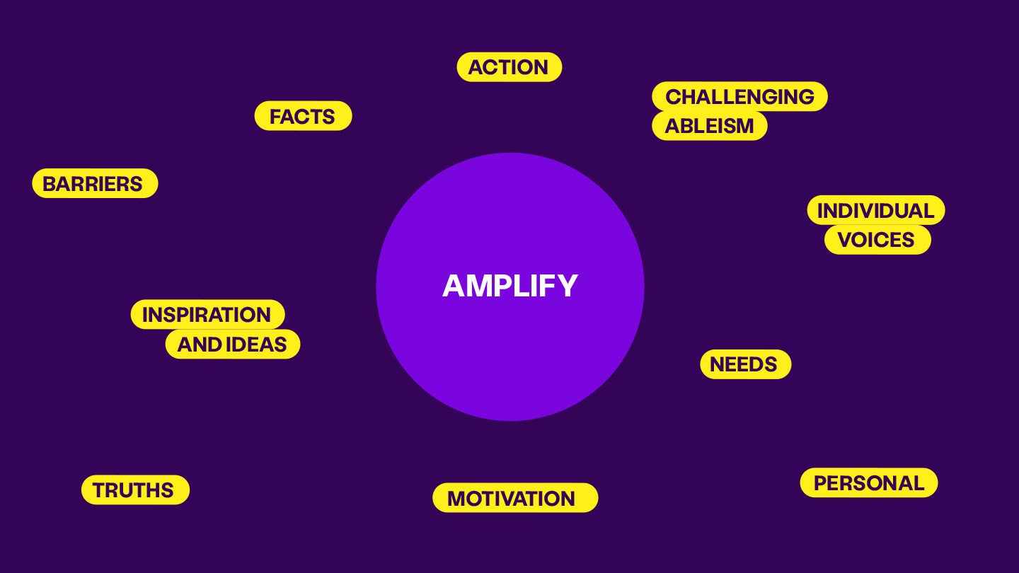
We want to become a distinct, recognisable and irresistible voice within the sector. Everything we do is to amplify the voices of the community.
Our visual identity uses this inspiration and creates a ‘space for amplification’ in all communication. This space is always present and represented in our logo and put to action throughout the brand expression.
We use the ‘amplification circle’ flexibly to:
- reinforce our message
- provoke action
- tell the everyday truths in imagery and illustration


