- Home
- Brand guidelines
- Guidelines
- How we look
- Graphic system overview
Graphic devices
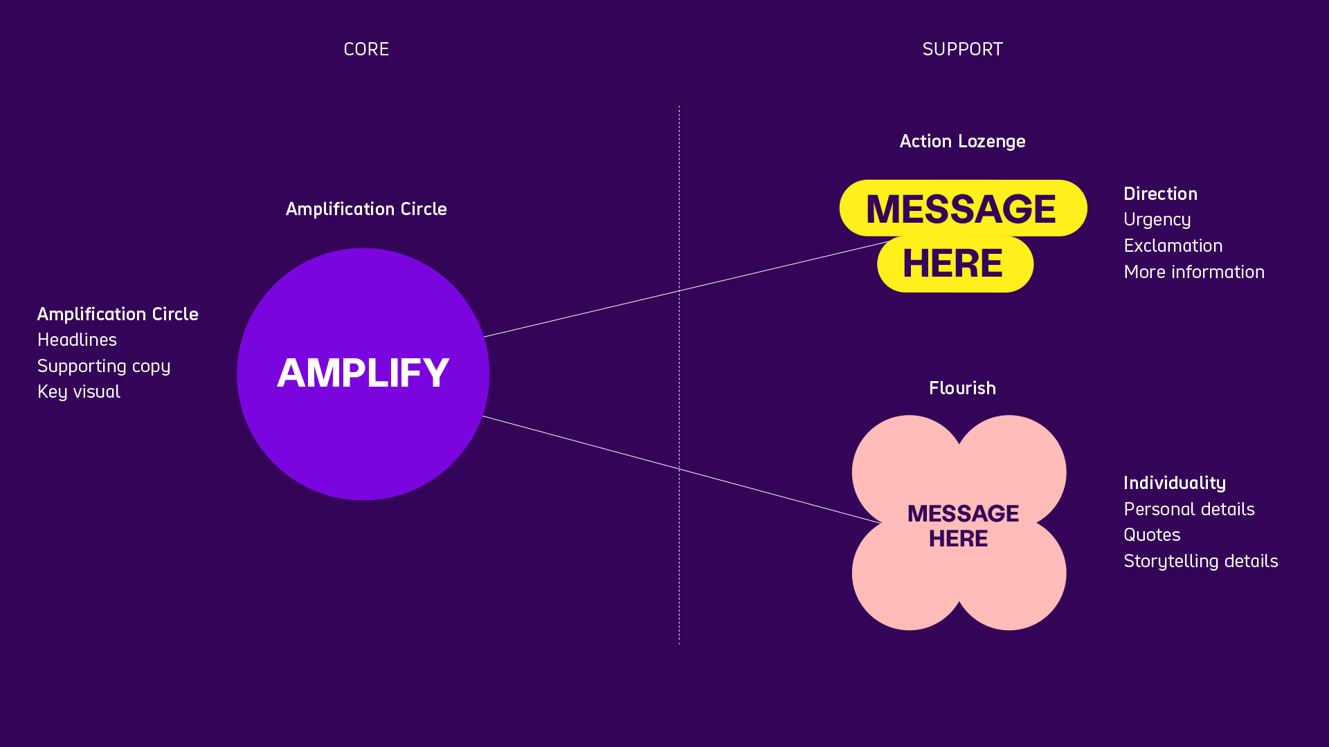
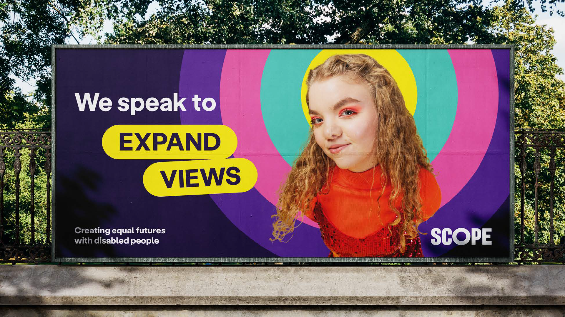
The 'Amplification Circle' our core graphic device. This is used to hold headlines, supporting copy, imagery and illustration.
To create brand flex, we have 2 supporting graphic devices, the 'Action Lozenge' and the 'Flourish'.

Each device has a very clear role to place and must be used carefully:
The ‘Amplification Circle’
The circle is our hero asset and holds our key message. We use it for:
- Headlines
- Supporting copy
- Key visual
The 'Action Lozenge'
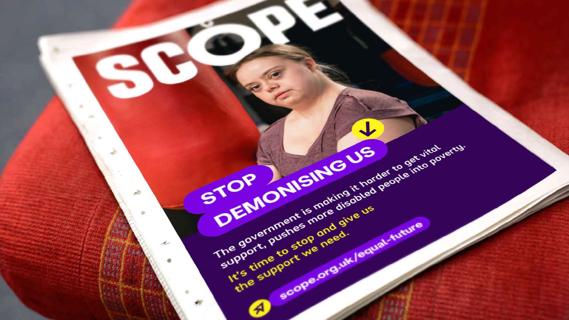
We use the Action Lozenge to create focus and direction:
- Urgency
- Exclamation
- More information
The ‘Flourish'
We use the flourish for more individual details:
- Personal details
- Quotes
- Storytelling detail
How we look when we're creating connections

Life made real
- Real stories in visual and verbal content.
- Authentic images, quotes, backed up by facts and relevant data.
Expressing character
- Celebrate quirks, individuals, intersectionality, and differences through unexpected elements. For example, slight overlaps, angles, disruptive content, small surprises.
- Flourishes but never decorative.
How we look when we're openly curious

Boldly simple
- Confidently state the truth and magnify the key issue through one simple image, headline, fact or graphic
- Create an uncomplicated and clear structure of information and simple type hierarchy
- Purple is the main recognisable colour
Open to all
- Fully inclusive imagery and storytelling
- Accessible and easy user experience
How we look when we're inspiring action

Positively bright
- Optimistically bright and energetic
- Larger than life and unmissable
- Bold, confident and colourful outlook
Strong way-finding
- Positive, energetic tone
- Show people what to do to make an impact
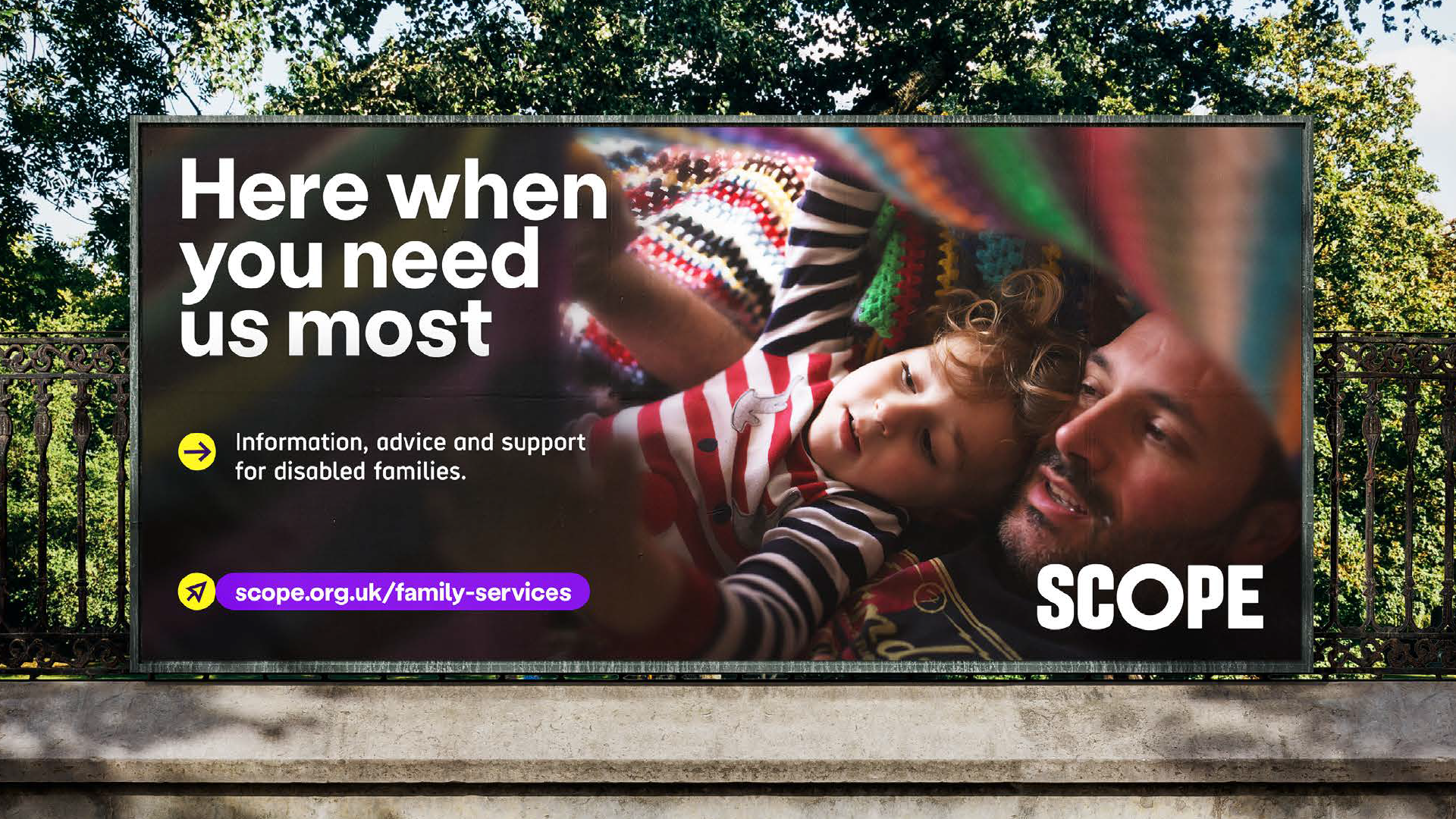
- Give clear direction at all times
- Visually impactful call to action

