How we use our brand

Layouts

Information is key - so hero it in simple but interesting ways

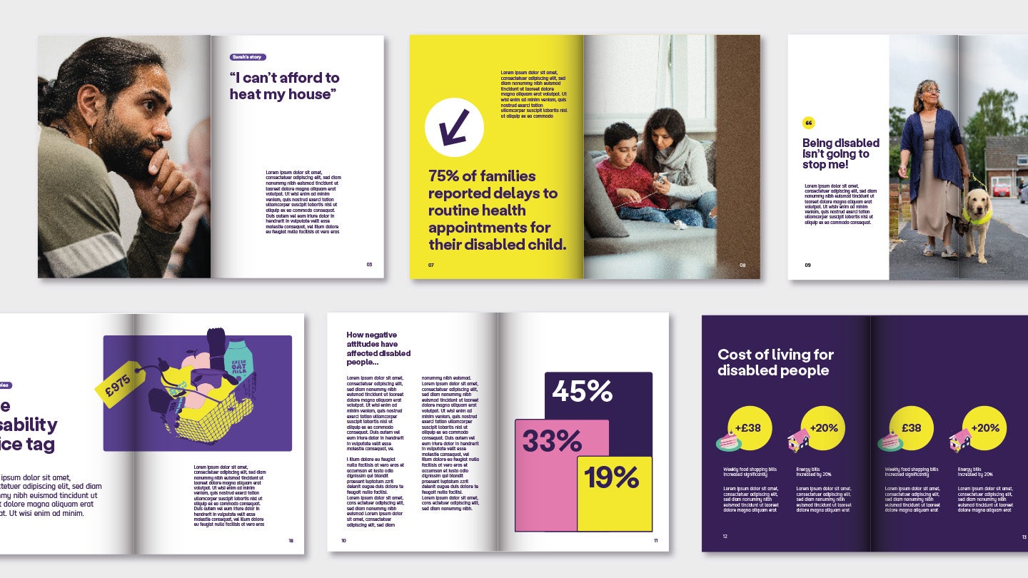
Examples of 6 page layouts. See 'image description' for a plain text version.
  • Image description

    Examples 1 to 3 have full page photography. Opposite pages have a large quotes or statements 'I can't afford to heat my house' and stat '75% of families reported delays to routine health appointments for their disabled child' and 'Being disabled isn't going to stop me'. Each has a small paragraph of body copy.

    Examples 4 to 6 show data. The first has the disability price tag with an illustration of a shopping basket and a tag with amount, this is over a 2 page spread and a large title 'the disability price tag'. 

    The second has a 3 bar chart with different stats on one page and then a full page article on the opposite page. The title is 'how negative attitudes have affected disabled people'.

    The last has yellow amplification circles with stats, and uses illustrations overlapping the bottom left of the circle. They span the 2 page spread. Each circle has a paragraph of text. "

Socials

Posts

Core posts

  • Purples, Yellow and White only
  • secondary colour palette can be used for retail posts, or where differentiation is needed
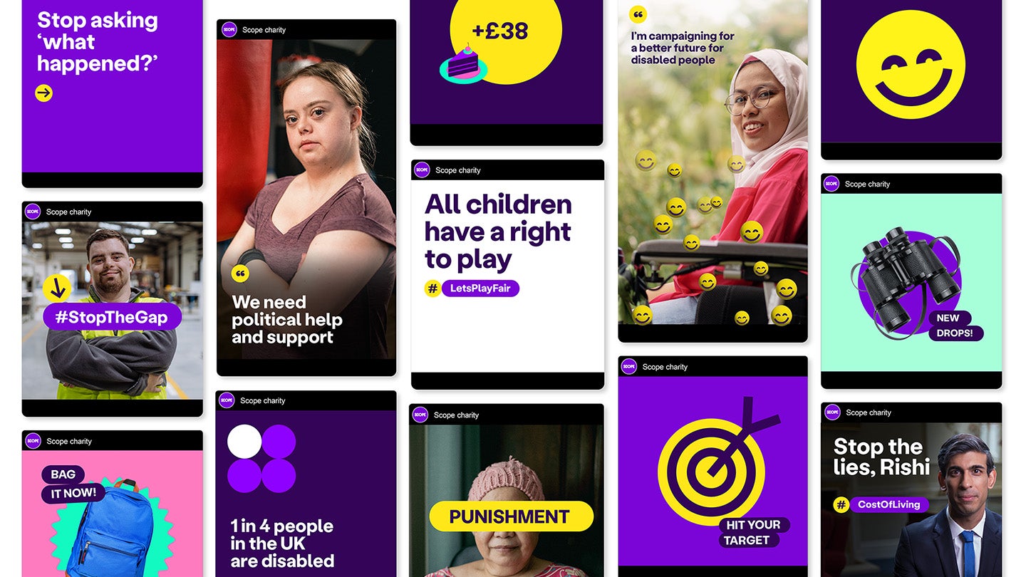

Selection of social posts. Some use lozenges for hashtags, 'Lets Play Fair' and 'Stop the Gap' and call to actions like 'bag it now' or 'New drops'. There's photography examples for for campaign posts. Including a yellow lozenge across a person's face saying 'punishment', and statements like 'we need political support' or 'Stop the lies, Rishi' . There are also examples of large icons and infographics.


Stories

For 'stories' and 'one-off' posts, the secondary colour palette should be used to create variety.
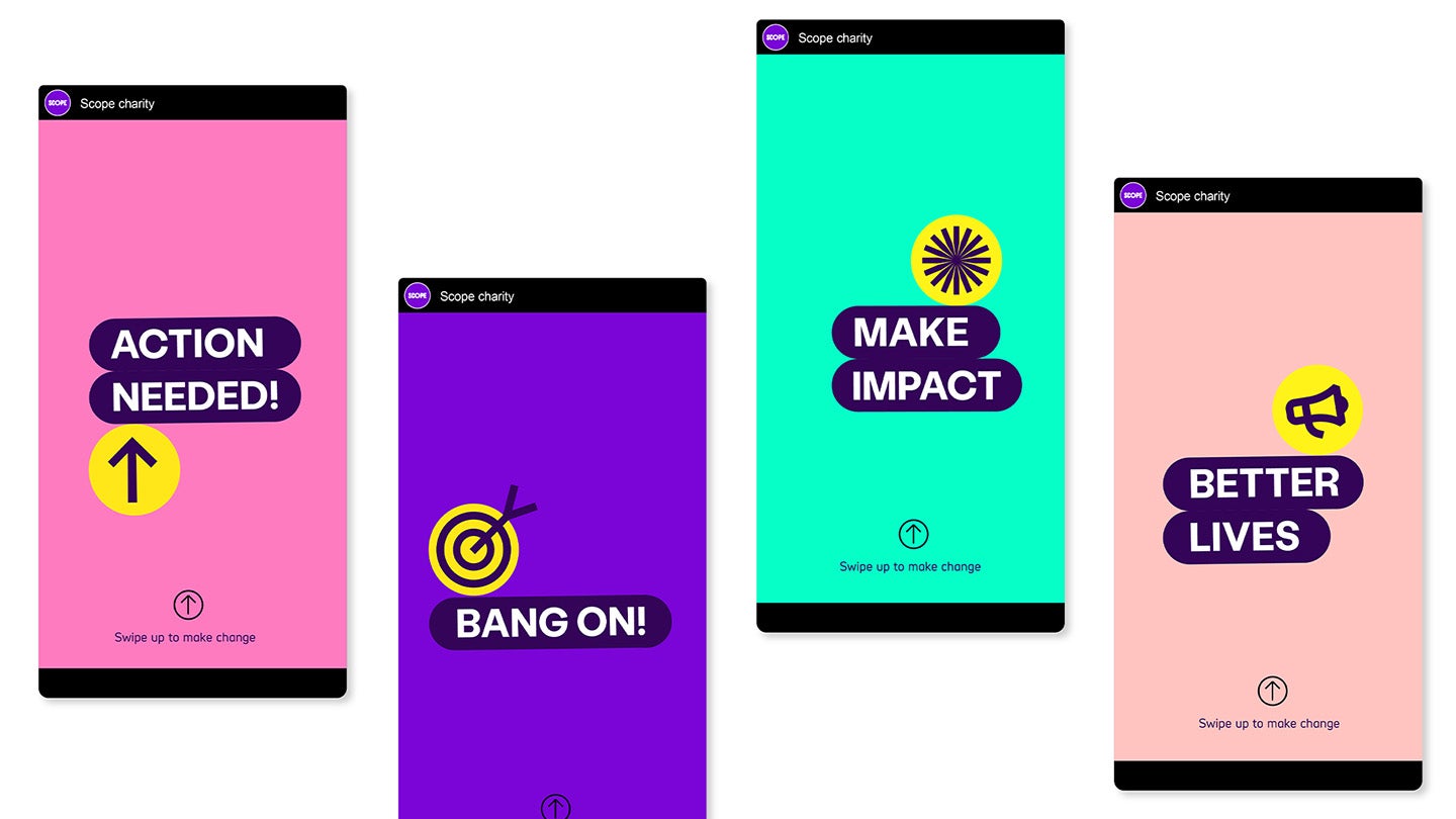

4 social stories examples. 1 has Bright Pink background with lozenges saying 'action needed' and an up arrow icon. 2 has Bright Purple background and the lozenge 'bang on' with bullseye icon above it. 3 has a Bright Green background and the lozenge 'make impact' with flower icon above. 4 has Pastel Pink backgound and the lozenge 'better lives' with a megaphone icon.


Homepage

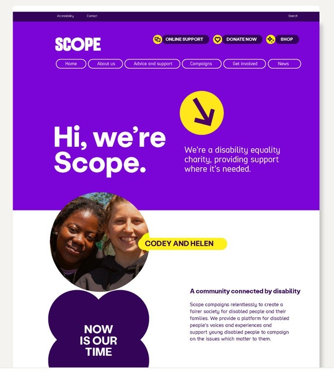
Predominantly core colour used with pops of secondary palette where necessary to aid navigation.

Scope homepage with bright purple background in the header and introduction. White background as it moves into personal story. Shows photo circle, lozenge and flourish on page.


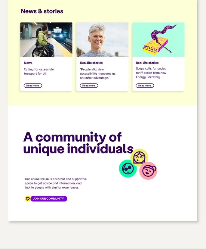
News and story section of homepage using pale yellow background and boxes for each story. Community section has white background and uses faces icons and lozenge call to action.

Fundraising and campaigning


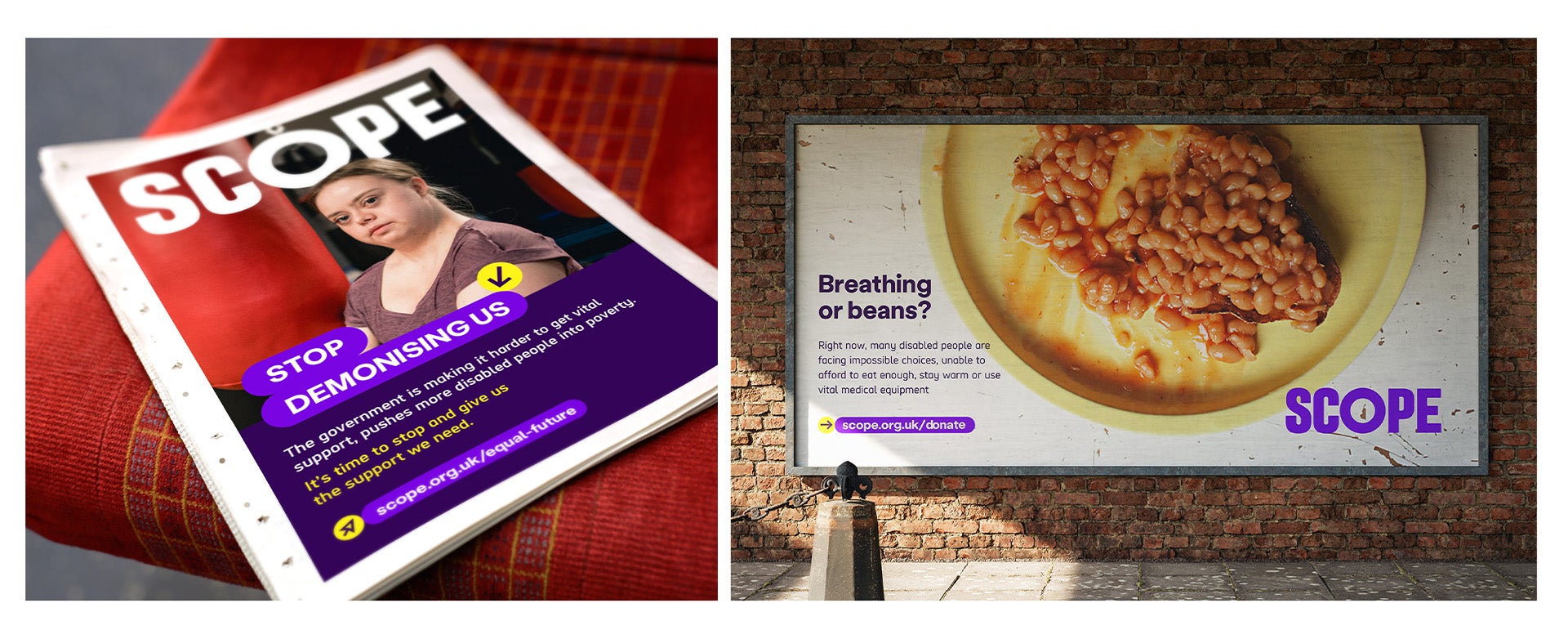
2 examples. One is a newspaper ad with Scope logo overlaid a photo. Lozenge used at the bottom of photo 'stop demonising us' dark purple block at the bottom with summary and link to Scope strategy in lozenge. Example 2 is a billboard with a photo of baked beans on a plate and the text 'breathing or beans?' with a summary and a lozenge to Scope's donate webpage below.


Billboards


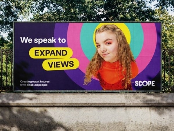
Billboard with photo overlaid multi-coloured amplification circle. To the left, text says 'we speak to' then in 2 lozenges 'expand views'. Our logo in bottom right and tagline on bottom left.


Community hub and E-learning


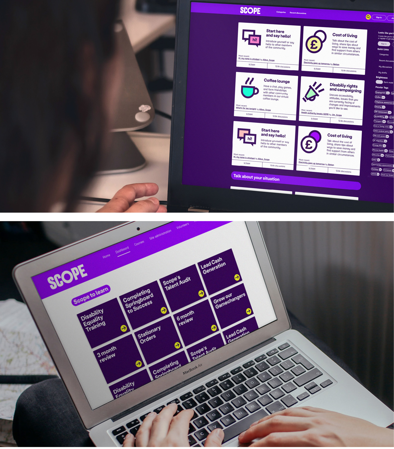
Scope online community homepage has dark purple background with white tiles for the different topics to click onto. Each one uses icons. Scope to learn homepage with dark purple tiles for each training topic.


Retail experience


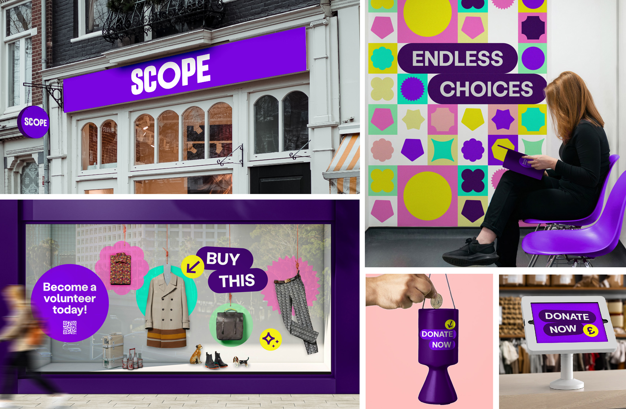
Scope store front with new brand purple and white logo. Shop window with lozenge saying 'buy this' and icon pointing at item. Donate now lozenges on screen and collection pots.


Merchandise


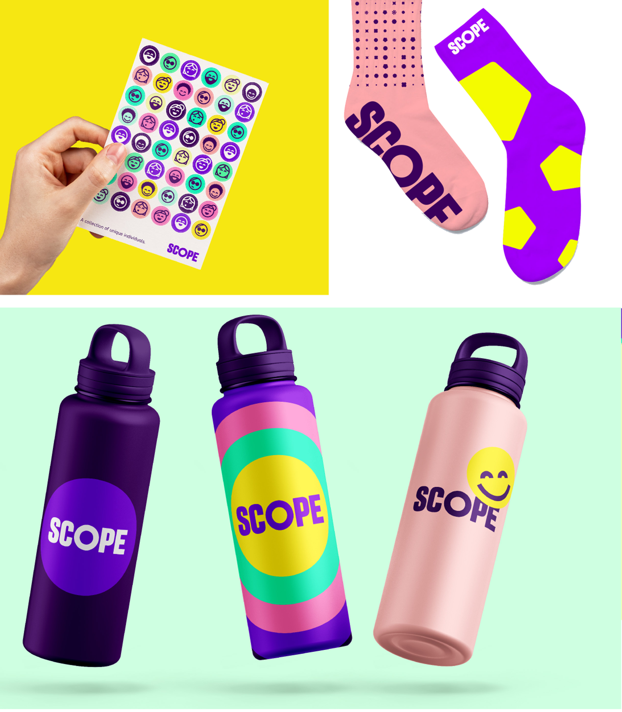
Stickers with our face icons. Socks with our logo using pastel pink and bright purple with yellow flourishes. Water bottles with Scope logo and amplification circles in different colours. 1 has smiley face icon.